Button
Dragging the Button form control onto the form canvas adds a new button field to your form. As with the other form controls, you may customize the style, appearance, and functionality of this control by editing its field properties.
Button Field Properties
Click the pencil icon to edit Button field properties and specify style, label, size, alignment, conditions, and actions. This section describes the field properties that you can edit for the Button control.
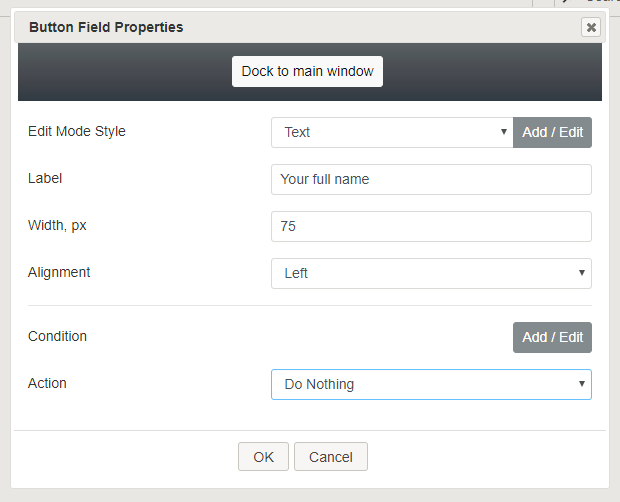
Dock to main window
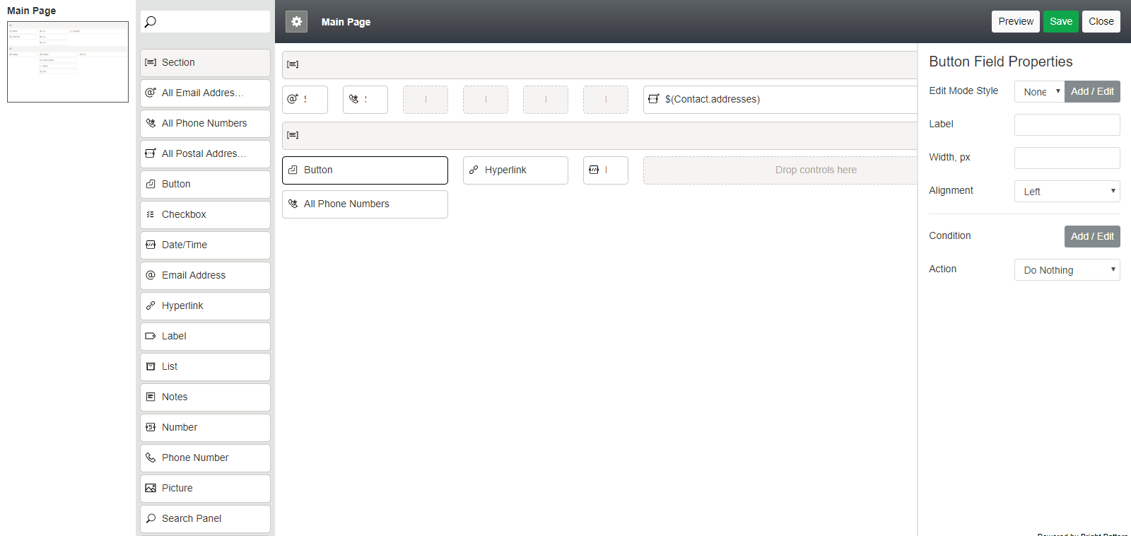
Click this button to dock the field properties on the form canvas at all times, rather than show the properties in a pop-up dialog.

Docking is convenient when you wish to edit properties and preview the form at the same time.
Edit Mode Style
Edit Mode Style presents a list of common styles from which to choose:
- None
- Text
- Title
- Label
- Hyperlink
- Note
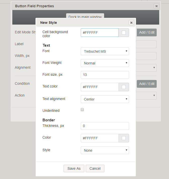
Clicking Add / Edit brings up the Edit Style dialog, where you specify the appearance of the control.
Label
Label is the text that will be shown on the button (e.g., "Buy Now" or "Send").
Width, px
Width, px is the label width (optional). If no width is specified, the button defaults to the entire column width.
Alignment
Alignment provides three alignment choices for the button:
- Left (default)
- Right
- Center
Condition
You can determine what kind of condition must be met in order for the button to perform a specific action (see the Action properties below). Click Add / Edit to add a condition or change one that's already been added.
The Edit Conditions dialog pops up, providing the following fields to complete:
- $() - Either enter a variable (if you know it), or click this button to select and map a variable to the condition.
- is / is not - Select either is or is not as part of the condition string
- Selector - Select from one of the following: empty, one of:, <, >, =
- Text field - Enter the word(s) or values that should be a part of the condition.

After you have made your selections, the condition statement should look something like $(ActivityHistory.media_type) is chat, which means that the activity history media type must be chat in order for the button to perform the action.
Other available buttons include:
- Delete - Click to delete the condition statement
- Add - Click to add another condition statement with different variables and selections
- OK - Click to save the condition
- Cancel - Click to cancel adding or editing
Action
Action is a drop-down menu offering the following possible actions that this button can provide.
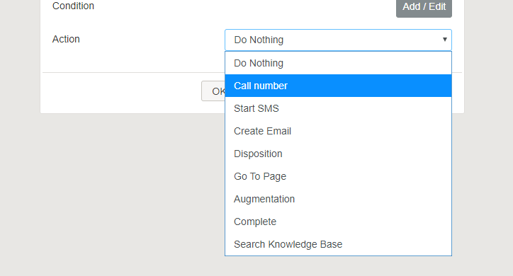
Do Nothing
Select Do Nothing if this button should not provide any action. When the user clicks this button on the form, nothing will happen.
Call number
Call number initiates a phone call.
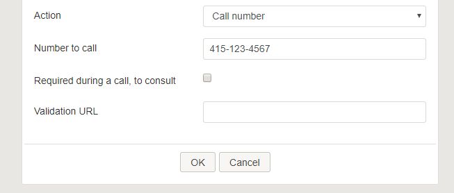
Upon selecting this action, the following additional properties are available:
- Number to call – Enter the phone number to be dialed.
- Required during a call, to consult - When this checkbox is selected, a transfer of the call must be attempted. If no transfer attempt is made, when the agent attempts to hang up, the form reverts to the initial form page with the unselected call button and outputs a warning with two additional button options: “The form requires consult transfer attempts made during the call [Cancel] or [Force Hang up].” If the agent attempts a transfer and the person does not answer, the form can be configured to allow the agent to take a message that can be subsequently emailed or sent via SMS/text. To configure these options, see Start SMS and Create Email.
- Validation URL – Enter the validation URL.
Start SMS
Start SMS initiates an SMS/text message to be sent to the specified phone number.
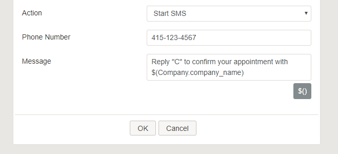
Upon selecting this action, the following additional properties are available:
- Phone Number - The phone number that will receive the SMS
- Message - Enter the desired text message to be sent
Create Email
Create Email initiates a new email message to be sent to the specified email address.
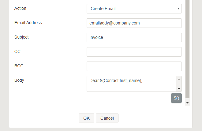
Upon selecting this action, the following additional properties are available:
- Email Address - The recipient's email address
- Subject - The subject line of the email
- CC - The email addresses of the recipients to be copied on the email
- BCC - The email addresses of the recipients to be blind-copied on the email
- Body - The text of the email
Disposition
Disposition enters a fixed disposition for the current call or interaction.

Upon selecting this action, the following additional properties are available:
- Disposition – Type the disposition name, if known
- Select Disposition – When this button is clicked, a pop-up dialog shows the following properties:
- Disposition from service – A drop-down menu shows the services available for your contact center. Selecting one of the services brings up the dispositions that can be selected. See Select Disposition below.
- Select Disposition – A drop-down menu shows the dispositions available for the selected service.
- Two Step Disposition - Selecting this checkbox enables dispositions to be set in two steps
- Validation URL - Enter the validation URL.
Go To Page
Go To Page navigates to other pages in a multi-page form.

Upon selecting this action, the following additional properties are available:
- Destination page – A drop-down menu lists the possible destination pages on the form
Augmentation
Augmentation runs a contact search in augmentation databases that have been configured for your contact center. There are no additional properties for this action.
Complete
The Complete action completes the interaction. Upon selecting this action, the following additional properties are available:
- Validation URL - Enter the validation URL.
Search Knowledge Base
Search Knowledge Base brings up the Knowledge Base search field.
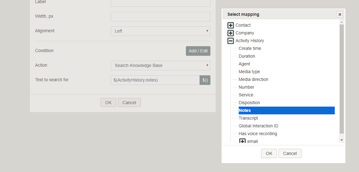
Upon selecting this action, the following additional properties are available:
- Text to search for - Enter the words to look up in Knowledge Base. Note that you can add variables to the search terms including those from custom fields, such as Activity History. For example, if a Knowledge Base article is used in an activity form, the blank, Knowledge Base-associated fields can be configured to prefill with values from activity history custom form fields. If an activity history field variable is not present in an activity form, it is not prefilled. Additionally, if a value is not set for the Knowledge Base article, the field does not prefill the form. If an agent has put some value in a field already, it is not prefilled (it will only prefill when empty).
< Previous | Next >