|
|
| (22 intermediate revisions by one other user not shown) |
| Line 1: |
Line 1: |
| − | = アドレス1住所= | + | = Address1 Postal Addresses= |
| − | アドレス1住所というコンポーネントは、住所、市区町村、都道府県、郵便番号、および追加の住所のフィールドを含む、一連の郵便住所のフィールドです。このコンポーネントは、表示されているフォームの例で赤線でマークされています。
| + | The Address1 Postal Addresses component is a set of postal address fields, including fields for address, city, state, zip code, and additional addresses. The component is outlined in red on the example form shown. |
| | | | |
| | + | '''Note''': This control is supported in version 5.x for forms created in the Form Builder application version 3.x. For component properties, see Bright Pattern Contact Center Documentation [https://help3x.brightpattern.com/3.18:Form-builder-reference-guide/Address1PostalAddresses version 3.x]. |
| | | | |
| − | [[File:Form-Address1-3x-50.PNG|800px|thumbnail|center|設定モードにおけるアドレス1 住所コンポーネント]]
| |
| | | | |
| − | | + | [[File:Form-Address1-3x-50.PNG|800px|thumbnail|center|Address1 Postal Addresses component in Configuration mode]] |
| − | このコンポーネントをフォームに追加するには、コンポーネントを押したまま、左側のコンポーネントメニューから右側の空白のフォームにドラッグします。
| |
| − | | |
| − | | |
| − | ==フィールドプロパティ ==
| |
| − | このコンポーネントのフィールドプロパティは次のとおりです。
| |
| − | | |
| − | | |
| − | [[File:Form-Address1-Properties-3x-50.PNG|450px|thumbnail|center|アドレス1 住所のフィールドプロパティ]] | |
| − | | |
| − | | |
| − | === Style ===
| |
| − | The ''Style'' property allows you to change the way that a control element appears on a form.
| |
| − | | |
| − | You can select a style from the following options:
| |
| − | * << None >>
| |
| − | * Text
| |
| − | * Title
| |
| − | * Label
| |
| − | * Hyperlink
| |
| − | * Note
| |
| − | | |
| − | You can also click '''add/edit''' to add another style or edit the selected style, choosing from different fonts, sizes, colors, and other style elements.
| |
| − | | |
| − | | |
| − | [[File:Form-Edit-Styles-Save-3x-50.PNG|450px|thumbnail|center|Select font, size, color, and other style elements]]
| |
| − | | |
| − | | |
| − | Clicking '''Save as''' allows you to name and save the style you just added/edited, and that style becomes available in the drop-down selector for the ''Style'' and ''Edit Style'' properties.
| |
| − | | |
| − | | |
| − | [[File:Form-Save-As-3x-50.PNG|450px|thumbnail|center|Save the style with a new name]]
| |
| − | | |
| − | | |
| − | === Edit Style ===
| |
| − | The ''Edit Style'' property allows you to select the style defined in the ''Style'' property. The style you select here is what is shown on the form.
| |
| − | | |
| − | | |
| − | === Name ===
| |
| − | The ''Name'' property allows you to change the name of the control as it appears on the Control Palette. For example, you can change the name "Address1 Postal Addresses" to simply "Address" or anything else.
| |
| − | | |
| − | | |
| − | === Form label ===
| |
| − | The ''Form label'' is the text label for this control, and it is shown on the form itself. For example, specifying form label "Home address" will display "Home address" on the form beside the Address1 Postal Addresses fields.
| |
| − | | |
| − | | |
| − | [[File:Form-Home-Address-3x-50.PNG|450px|thumbnail|center|Form label on editable preview]]
| |
| − | | |
| − | | |
| − | === Display Type ===
| |
| − | For this control, the ''display type'' is automatically set to '''Postal addresses'''. Note that there are many other display types from which to choose.
| |
| − | | |
| − | | |
| − | [[File:Form-Display-Type-3x-50.PNG|450px|thumbnail|center|Display type selection]]
| |
| − | | |
| − | | |
| − | === Data field array ===
| |
| − | For this control, the ''Data field array'' is automatically set to '''Contact.addresses''', which is a variable that gets and fills in contact address data for your contact center.
| |
| − | | |
| − | | |
| − | === Options ===
| |
| − | * '''Editable''' - Select this option to allow the user to edit the field on the form.
| |
| − | * '''Required''' - Select this option to require the user to fill in the field on the form.
| |
Latest revision as of 05:14, 9 September 2021
Address1 Postal Addresses
The Address1 Postal Addresses component is a set of postal address fields, including fields for address, city, state, zip code, and additional addresses. The component is outlined in red on the example form shown.
Note: This control is supported in version 5.x for forms created in the Form Builder application version 3.x. For component properties, see Bright Pattern Contact Center Documentation version 3.x.
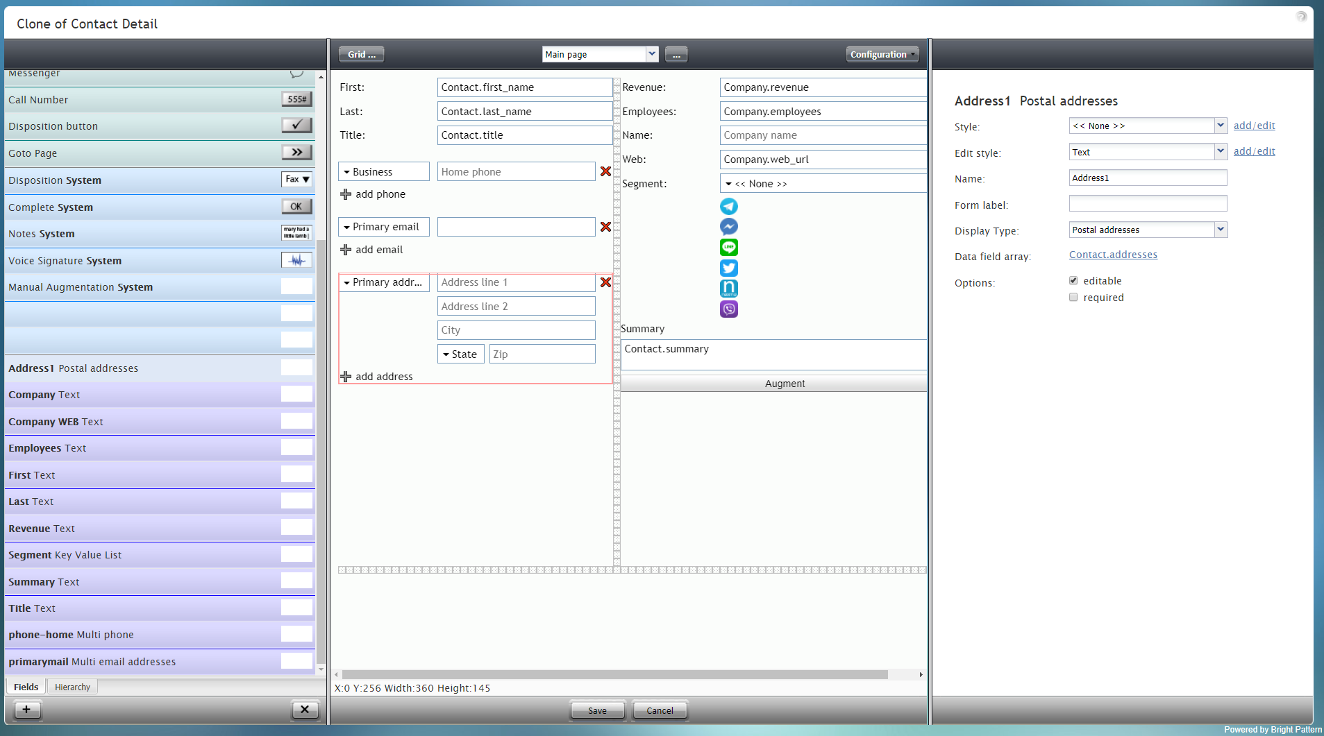
Address1 Postal Addresses component in Configuration mode
