imported>Sergem |
(Updated via BpDeleteTranslateTags script) |
||
| Line 1: | Line 1: | ||
| − | + | = Number= | |
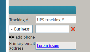
The ''Number'' control places any kind of number on a form (e.g., invoice number, ticket number, tracking number, etc.). In Preview mode, this control appears as shown. | The ''Number'' control places any kind of number on a form (e.g., invoice number, ticket number, tracking number, etc.). In Preview mode, this control appears as shown. | ||
| − | |||
[[File:Form-Number-Preview-50.PNG|350px|thumbnail|center|Number field shown on a form]] | [[File:Form-Number-Preview-50.PNG|350px|thumbnail|center|Number field shown on a form]] | ||
| − | == Field Properties == | + | == Field Properties == |
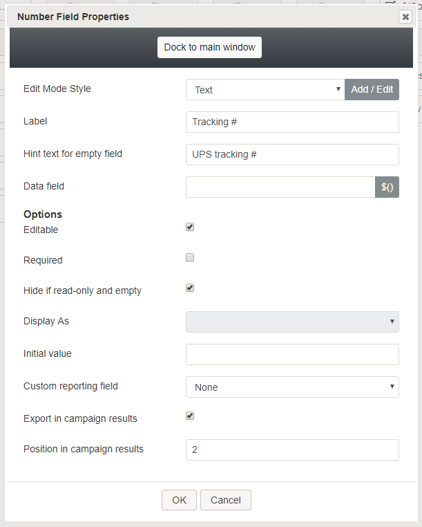
Once you have placed the control onto your form canvas, you can edit the field properties by clicking the pencil icon on the component. The field properties are described as follows. | Once you have placed the control onto your form canvas, you can edit the field properties by clicking the pencil icon on the component. The field properties are described as follows. | ||
| − | |||
[[File:Form-Number-Properties-50.PNG|450px|thumbnail|center|Number properties]] | [[File:Form-Number-Properties-50.PNG|450px|thumbnail|center|Number properties]] | ||
| − | === Edit Mode Style === | + | === Edit Mode Style === |
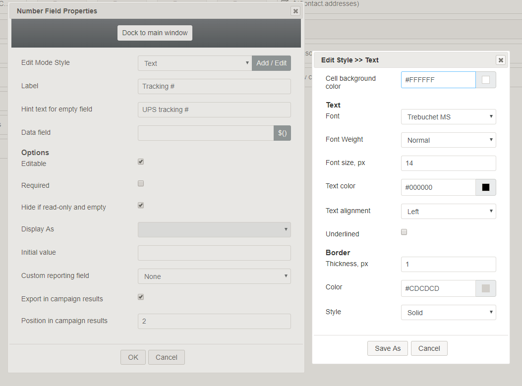
''Edit Mode Style'' is the common property that allows you to select, edit, or add a [[form-builder-reference-guide/CreatingNewForms#Style|style]] for this form control. For example, you may select "Text" from the selector, and click '''Add / Edit''' to change the style (e.g., font, color, etc.) of any text shown on the form. | ''Edit Mode Style'' is the common property that allows you to select, edit, or add a [[form-builder-reference-guide/CreatingNewForms#Style|style]] for this form control. For example, you may select "Text" from the selector, and click '''Add / Edit''' to change the style (e.g., font, color, etc.) of any text shown on the form. | ||
| − | |||
[[File:Form-Number-Style-50.PNG|650px|thumbnail|center|Add / Edit style]] | [[File:Form-Number-Style-50.PNG|650px|thumbnail|center|Add / Edit style]] | ||
| − | === Label === | + | === Label === |
''Label'' is the name of this control that will be displayed on the form (e.g., "Tracking #"). | ''Label'' is the name of this control that will be displayed on the form (e.g., "Tracking #"). | ||
| − | === Hint text for empty field === | + | === Hint text for empty field === |
This text input field is where you enter any text that you wish to display in this control's empty fields. The hint text indicates to the user what kind of text belongs in this field (e.g., "UPS tracking #"). | This text input field is where you enter any text that you wish to display in this control's empty fields. The hint text indicates to the user what kind of text belongs in this field (e.g., "UPS tracking #"). | ||
| − | === Data field === | + | === Data field === |
The ''data field'' is where you specify or select a variable that gets and includes data on the form. | The ''data field'' is where you specify or select a variable that gets and includes data on the form. | ||
| − | === Options === | + | === Options === |
==== Editable ==== | ==== Editable ==== | ||
Select this checkbox to allow users to edit the field. | Select this checkbox to allow users to edit the field. | ||
| − | ==== Required ==== | + | ==== Required ==== |
Select this checkbox to require users to fill in the Number field. | Select this checkbox to require users to fill in the Number field. | ||
| − | ==== Hide if read-only and empty ==== | + | ==== Hide if read-only and empty ==== |
Select this checkbox to hide the Number field if it's empty or marked as read-only. | Select this checkbox to hide the Number field if it's empty or marked as read-only. | ||
| − | ==== Display As ==== | + | ==== Display As ==== |
This option is reserved for future use. | This option is reserved for future use. | ||
| − | ==== Initial value ==== | + | ==== Initial value ==== |
You can indicate the initial value to be shown in the Number field. This is optional. | You can indicate the initial value to be shown in the Number field. This is optional. | ||
| − | ==== Custom reporting field ==== | + | ==== Custom reporting field ==== |
The ''Custom reporting field'' is the [[contact-center-administrator-guide/CustomReportingFields|custom reporting field]] created for your contact center (if any). Such a field is unique to your contact center, as it is different from any default fields. If you do not have any custom reporting fields, select '''None''' from the drop-down list. | The ''Custom reporting field'' is the [[contact-center-administrator-guide/CustomReportingFields|custom reporting field]] created for your contact center (if any). Such a field is unique to your contact center, as it is different from any default fields. If you do not have any custom reporting fields, select '''None''' from the drop-down list. | ||
| − | ==== Export in campaign results ==== | + | ==== Export in campaign results ==== |
Select this checkbox to export the data collected in the Number field in your call center's campaign results. | Select this checkbox to export the data collected in the Number field in your call center's campaign results. | ||
| − | ==== Position in campaign results ==== | + | ==== Position in campaign results ==== |
Indicate the desired position (e.g., "1") for the data collected in the Number field to be placed in campaign results. | Indicate the desired position (e.g., "1") for the data collected in the Number field to be placed in campaign results. | ||
| − | |||
| − | |||
| − | |||
| − | |||
| − | |||
| − | |||
Latest revision as of 04:13, 29 May 2024
Number
The Number control places any kind of number on a form (e.g., invoice number, ticket number, tracking number, etc.). In Preview mode, this control appears as shown.
Field Properties
Once you have placed the control onto your form canvas, you can edit the field properties by clicking the pencil icon on the component. The field properties are described as follows.
Edit Mode Style
Edit Mode Style is the common property that allows you to select, edit, or add a style for this form control. For example, you may select "Text" from the selector, and click Add / Edit to change the style (e.g., font, color, etc.) of any text shown on the form.
Label
Label is the name of this control that will be displayed on the form (e.g., "Tracking #").
Hint text for empty field
This text input field is where you enter any text that you wish to display in this control's empty fields. The hint text indicates to the user what kind of text belongs in this field (e.g., "UPS tracking #").
Data field
The data field is where you specify or select a variable that gets and includes data on the form.
Options
Editable
Select this checkbox to allow users to edit the field.
Required
Select this checkbox to require users to fill in the Number field.
Hide if read-only and empty
Select this checkbox to hide the Number field if it's empty or marked as read-only.
Display As
This option is reserved for future use.
Initial value
You can indicate the initial value to be shown in the Number field. This is optional.
Custom reporting field
The Custom reporting field is the custom reporting field created for your contact center (if any). Such a field is unique to your contact center, as it is different from any default fields. If you do not have any custom reporting fields, select None from the drop-down list.
Export in campaign results
Select this checkbox to export the data collected in the Number field in your call center's campaign results.
Position in campaign results
Indicate the desired position (e.g., "1") for the data collected in the Number field to be placed in campaign results.


