Chat Initiation via Contact Tabs
Any visitor to your site can start a web chat by clicking on the chat widget's Contact tab. When customizing your chat widget, you have the option of requesting that visitors fill out a Pre-Chat form or a Leave a Message form. The properties of the Contact tab and these forms are described in this section.
Contact Tab
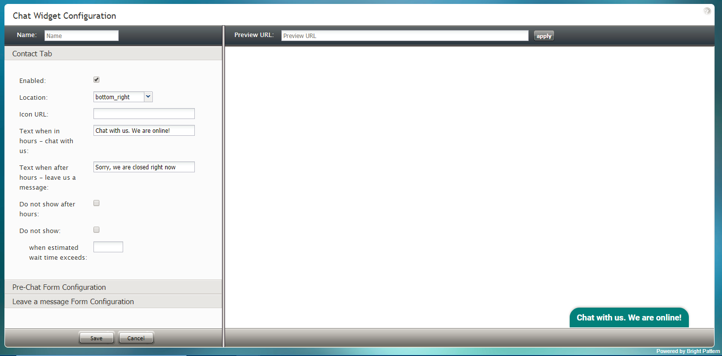
The Contact tab is what visitors to your website click in order to initiate a web chat. In the Chat Widget Configuration application, you can define the location, style, and color of this tab as it will appear on your site.
Properties
The following properties determine the color, placement, and text of the chat widget's Contact tab.
Enabled
If the Enabled checkbox is selected, the Contact Tab will be shown on the chat widget.
Location
Location is where the chat widget will be placed on your webpage:
- top_left
- top_middle
- top_right
- right_top
- right_middle
- right_bottom
- bottom_left
- bottom_middle
- bottom_right
- left_top
- left_middle
- left_bottom
Icon URL
The Icon URL is the web address of your company icon or logo. In the Icon URL field, enter the desired icon's URL to see it shown on the left side of the Contact tab.
Text when in hours - chat with us
This is the text shown when the chat widget is clicked during your company's hours of operation. Enter the desired text to be displayed on the widget when agents are available to chat (e.g., "Chat with us!" or "Click to chat.").
Text when after hours - leave us a message
This is the text shown when the chat widget is clicked outside of your company's hours of operation (e.g., "Leave us a message.").
Do not show after hours
When this checkbox is selected, the chat widget is not displayed outside of your contact center's hours of operation.
Do not show
Select this checkbox when the chat widget should be hidden from view when the estimated wait time exceeds a certain threshold (see Enter the estimated wait time threshold in seconds below).
Enter the estimated wait time threshold in seconds
Enter the maximum estimated wait time (EST) that is allowed to elapse before the chat widget is hidden from view.
Pre-Chat Form Configuration
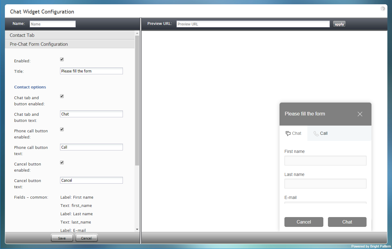
Pre-chat forms are shown to customers when they first click the chat contact tab (i.e., the small tab that displays text such as, "Chat with us! We are online") to initiate a web chat. These forms collect data from the customer. By editing the pre-chat form properties, you can customize the fields that customers will fill in (e.g., phone number, email, reason for chat, etc.).
Properties
The following properties determine the fields and text shown on the chat widget's Pre-Chat form.
Enabled
If the Enabled checkbox is selected, the Pre-Chat form will be shown on the chat widget.
Title
Title is the unique name of the form. The title is displayed at the top of the form for customers to see.
Contact options
Chat tab and button enabled
When this checkbox is selected, the Pre-Chat form displays the Chat tab at the top of the form. Customers click the Chat tab to enter information (as specified in the fields below) before the chat interaction begins.
Chat tab and button text
Chat tab and button text is the text that will be shown on the Chat tab, if the Chat tab and button are enabled.
Phone call button enabled
When this checkbox is selected, the Pre-Chat form displays the Call tab at the top of the form and the Call button at the bottom of the form. When the customer enters information on the form and clicks the Call button, the agent accepts a chat and can call the customer's provided phone number using the Initiate call button.
Phone call button text
Phone call button text is the text that will be shown on the Call tab, if the Phone call button is enabled.
Cancel button enabled
When this checkbox is selected, the Pre-Chat form displays the Cancel button at the bottom of the form. Customers wishing to close a filled-out form may click the Cancel button.
Cancel button text
Cancel button text is the text shown on the button to cancel the chat or phone call.
Fields - common
Specify here the fields that should appear on both Chat and Phone tabs of this form; some fields are included by default - you can edit and/or delete these fields and add new ones.
The following form field types and labels are included:
- Label: First name
- Text: first_name
- Label: Last name
- Text: last_name
- Label: E-mail
- Text: email
For more information, see sections Working with Form Fields.
Fields - phone
Specify here the fields that should appear on both Chat and Phone tabs of this form; some fields are included by default - you can edit and/or delete these fields and add new ones.
The following phone field types and labels are included:
- Label: Phone
- Callback phone number: phone_number
For more information, see sections Working with Form Fields.
Fields - chat
Specify here the fields that should appear on both Chat and Phone tabs of this form; some fields are included by default - you can edit and/or delete these fields and add new ones.
The following chat field types and labels are included:
- Label: Message
- Multiline text: message
For more information, see sections Working with Form Fields.
Leave a Message Form Configuration
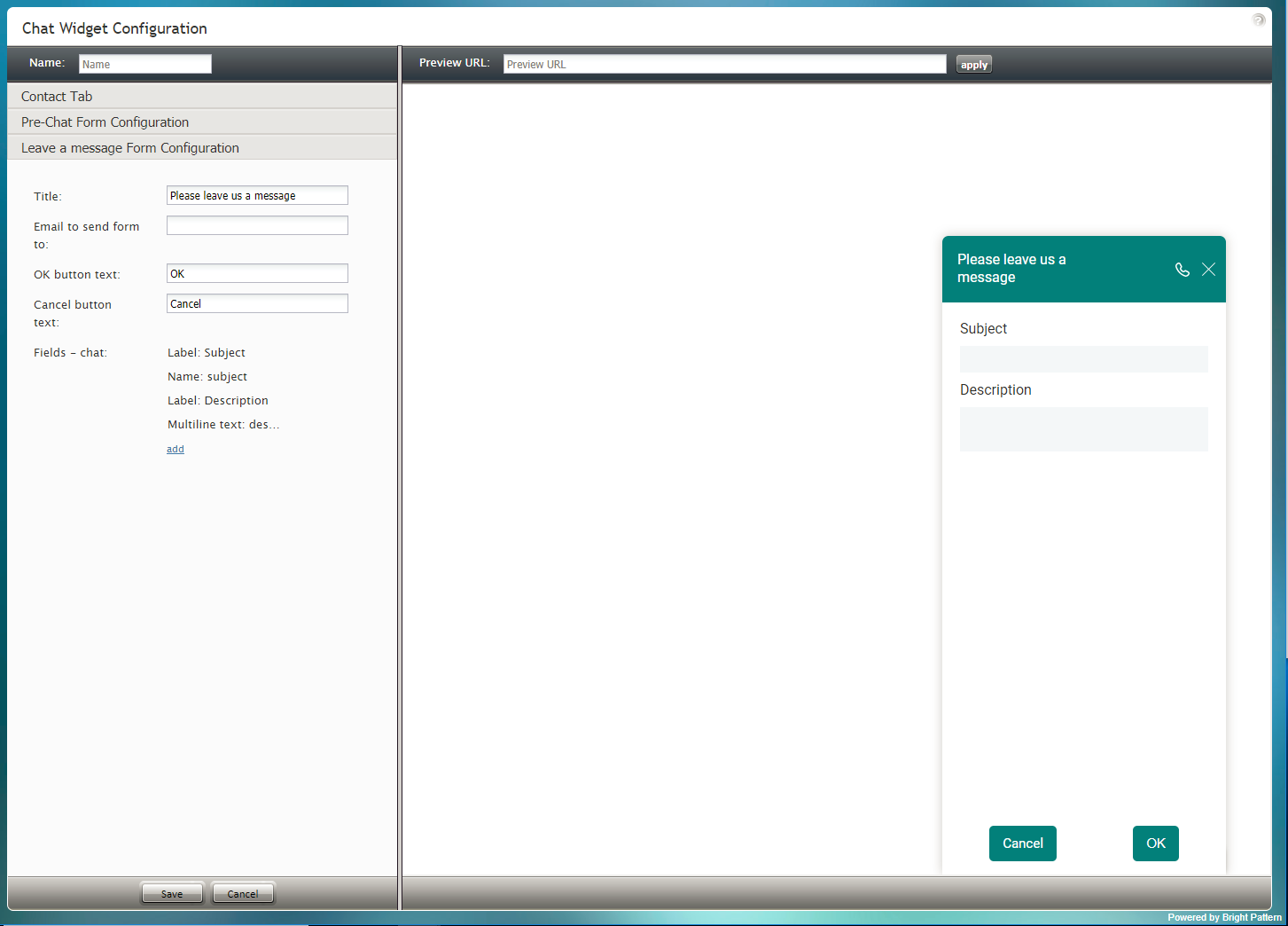
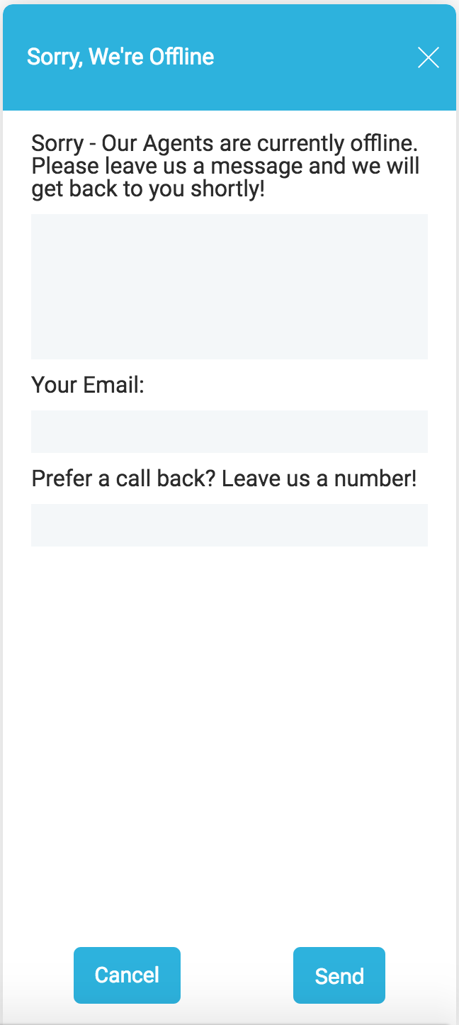
The Leave a Message form is given to customers who try to initiate a web chat outside of business hours or when no agents are available. The form allows customers to provide a detailed message for your contact center when they are unable to chat with an agent.
You can specify the fields that should appear on both Chat and Phone tabs of this form; note that some fields are included by default.
Properties
The following properties determine the fields and text shown on the chat widget's Leave a Message form.
Title
Title is the unique name of the form. The title is displayed at the top of the form for customers to see.
Email to send form to
This is the email address of the person that will receive the form/message.
OK button text
The OK button text is what will be shown on the button to send the form/message.
Cancel button text
Cancel button text is the text shown on the button to cancel the message.
Fields - chat
The following chat field types and labels are included:
- Name: subject
- Label: Subject
- Label: Description
For more information, see section Working with Form Fields.


