All Email Addresses
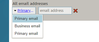
The All Email Addresses control places an email selector on a form, enabling a user to select from and include multiple types of email addresses (e.g., "primary" or "business"). In Preview mode, this control appears as shown.
Field Properties
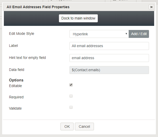
Once you have placed the control onto your form canvas, you can edit the field properties by clicking the pencil icon on the component. The field properties are described as follows.
Edit Mode Style
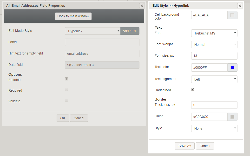
Edit Mode Style is the common property that allows you to select, edit, or add a style for this form control. For example, you may select "Hyperlink" from the selector, and click Add / Edit to change the style (e.g., text, font, color, etc.) of the email address hyperlink.
Label
Label is the name of this control that will be displayed on the form (e.g., "Your email addresses").
Hint text for empty field
This text input field is where you enter any text that you wish to display in this control's empty fields. The hint text indicates to the user what kind of text belongs in this field (e.g., "business email address").
Data field
The data field is read-only, displaying the variable $(Contact.emails), which gets and inserts the specified contact email addresses.
Options
- Editable - Select this checkbox to allow users to edit these email address types.
- Required - Select this checkbox to require users to enter email addresses in these fields. Note that Required is enabled only if the field is editable.
- Validate - Select this checkbox to allow the emails entered to be validated. Note that Validate value is enabled only if the field is editable.
< Previous | Next >


