Text
The Text control places some amount of text on a form. For example, this text could be a form title, URL, policy information, shipping guidelines, text from Knowledge Base articles, or anything that your contact center requires or desires to be on a form.
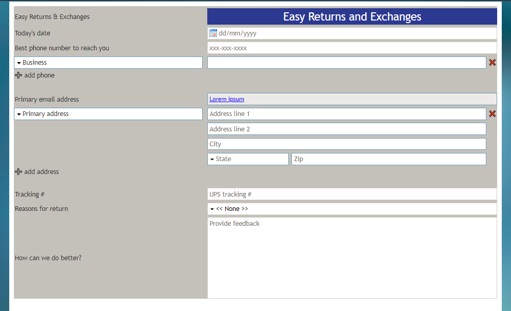
In Preview mode, the Text control appears as shown. In this example, the Text control is styled as a title ("Easy Returns and Exchanges"), in a larger font size and with a contrasting background color.
Field Properties
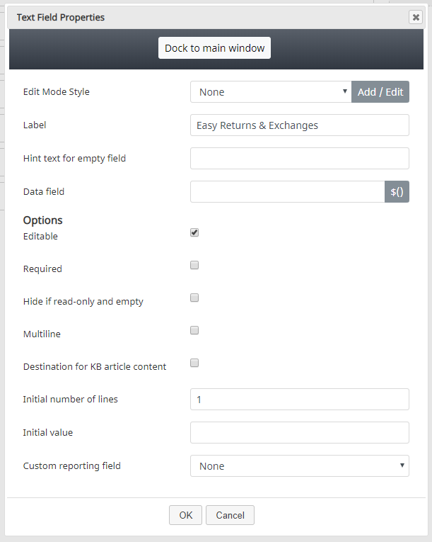
Once you have placed the control onto your form canvas, you can edit the field properties by clicking the pencil icon on the component. The field properties are described as follows.
Edit Mode Style
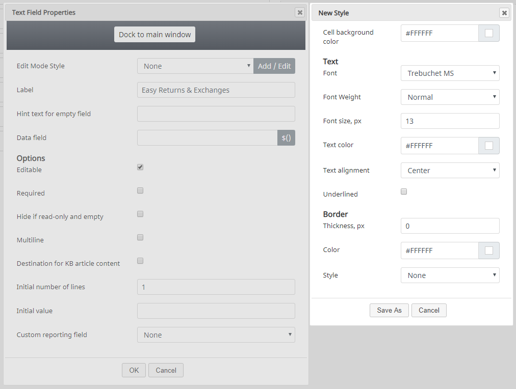
Edit Mode Style is the common property that allows you to select, edit, or add a style for this form control. For example, you may select "Text" from the selector, and click Add / Edit to change the style (e.g., text, font, color, etc.) of the field displayed on the form.
In the example shown, the Text control is styled as a title, in a larger font size and with a contrasting background color.
Label
Label is the name of this control that will be displayed on the form (e.g., "Easy Returns & Exchanges").
Hint text for empty field
This text input field is where you enter any text that you wish to display in this control's empty fields. The hint text indicates to the user what kind of text belongs in this field (e.g., "form title").
Data field
The data field is where you enter a specific variable or select a variable to get and insert data into the form. For example, if a Knowledge Base article is used in an activity form, the blank, Knowledge Base-associated fields can be configured to prefill with values from activity history custom form fields. If an activity history field variable is not present in an activity form, it is not prefilled. Additionally, if a value is not set for the Knowledge Base article, the field does not prefill the form. If an agent has put some value in a field already, it is not prefilled (it will only prefill when empty).
Options
Editable
Select this checkbox to allow users to edit the Text field. This box is checked by default.
Required
Select this checkbox to require users to enter text. Note that Required is enabled only if the field is editable.
Hide if read-only and empty
Select this checkbox to hide the Text field if it's empty or marked as read-only.
Multiline
Select this checkbox to indicate that the Text control will contain multiple lines of text.
Destination for KB article content
Select this checkbox to indicate that Knowledge Base content will be placed inside this Text field.
Initial number of lines
Specify how many lines of text should be available. The default value is 1; a valid range is 1 to 99.
Initial value
You can indicate the initial value to be shown on the Text control. This is optional.
Custom reporting field
The Custom reporting field is the custom reporting field created for your contact center (if any). Such a field is unique to your contact center, as it is different from any default fields. If you do not have any custom reporting fields, select None from the drop-down list.


