US State
The US State control places a selector on a form, enabling users to select a certain state (e.g., California or "CA") in the United States. In Preview mode, this control appears as shown.
Field Properties
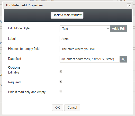
Once you have placed the control onto your form canvas, you can edit the field properties by clicking the pencil icon on the component. The field properties are described as follows.
Edit Mode Style
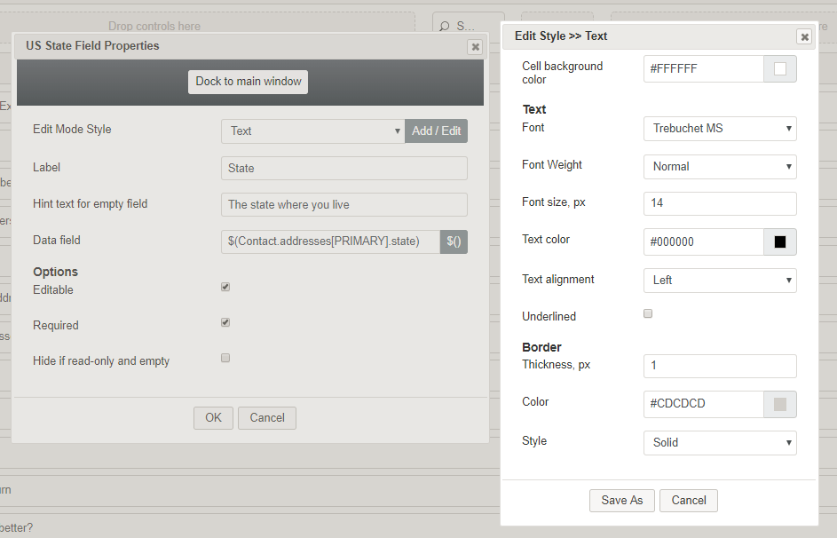
Edit Mode Style is the common property that allows you to select, edit, or add a style for this form control. For example, you may select "Text" from the selector, and click Add / Edit to change the style (e.g., text, font, color, etc.) of the list fields displayed on the form.
Label
Label is the name of this control that will be displayed on the form (e.g., "Reasons for return").
Hint text for empty field
This text input field is where you enter any text that you wish to display in this control's empty fields. The hint text indicates to the user what kind of text belongs in this field (e.g., "The state where you live").
Data field
The data field is where you enter a specific variable or select a variable to get and insert data into the US State field (e.g., $(Contact.addresses[PRIMARY].state))
Options
Editable
Select this checkbox to allow users to edit the field.
Required
Select this checkbox to require users to make a selection. Note that Required is enabled only if the field is editable.
Hide if read-only and empty
Select this checkbox to hide the US State control.


