提供: Bright Pattern Documentation
• English
Label
The Label component is used to add text to your form, such as headings, instructions, and help text.
Note: This control is supported in version 5.x for forms created in the Form Builder application version 3.x.
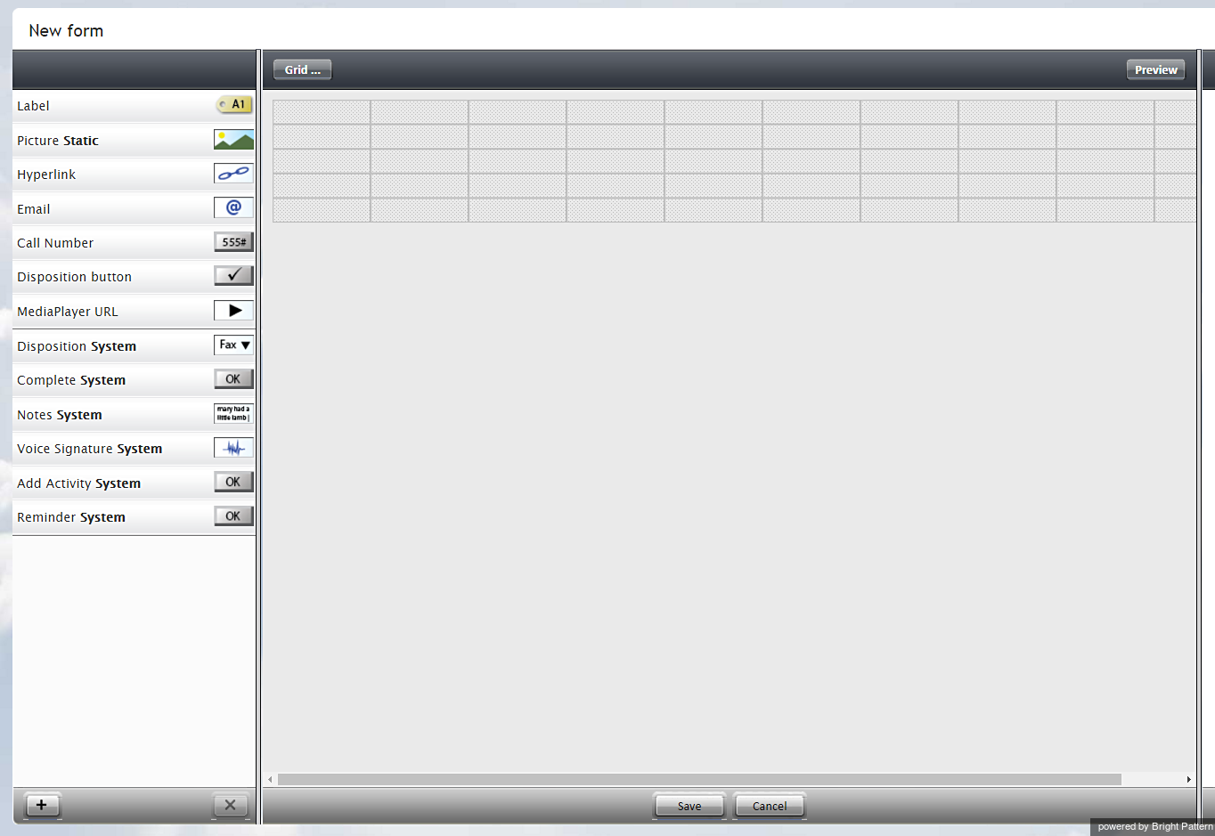
To add this component to your activity form, hold and drag the component from the component menu on the left, onto the blank form on the right.
Settings
The following settings can be specified for the Label component.
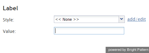
Style
Select or define the text style for this element. Choose from the following options:
- << None >>
- Text
- Title
- Label
- Hyperlink
- Note
Value
Enter the text to be displayed. All or part of this text can be a scenario variable in the $(varname) format.


