Title and Controls
In View mode, the following fields and controls are always shown:
- Title and menu bar
 Wallboard selector for selecting a personal or global wallboard
 Navigation arrows for flipping from one wallboard to the next
 Menu icon for working with wallboards

A user with a privilege Customize Wallboards has additional elements that appear on the wallboard while in Edit mode:
 Title field for changing the name of the wallboard
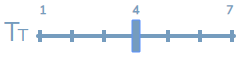 Font size control for adjusting the header font size in widgets as well as the text font size in grid widgets
 Theme selector for selecting a light or dark theme
 Save button for applying changes when in Edit mode

Hide Title Bar
An option in the menu called Hide Title Bar controls the title and controls display in View mode. If the Hide Title Bar option is enabled, it is hidden until the user’s mouse hovers over the border area over the top row of cards (i.e., spaces on the wallboard). When Hide Title Bar is disabled, the title reappears, shifting the content down on the display. Once the mouse has left the title area, the title disappears, shifting the content up.


Font Size Views
While in Edit mode, the font size control allows you to adjust the header font size in widgets as well as the text font size in the Agent Grid widget and the Service Grid widget. Enlarging the font size in grids widgets is useful for examining the detailed information they contain. The font slider has seven presets, allowing you to determine the best size for your wallboard. The following images illustrate how the enlarged text looks in an Agent Grid widget. Note that enlarged text works best with fewer widgets.


