Spacer
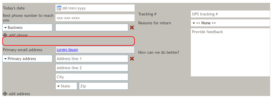
The Spacer control adds space in between other controls on a form. You can edit the Spacer's height and style in Field Properties. In Preview mode, this control appears as shown. The area outlined in red is the spacer placed in between the phone number and email address controls.

Field Properties
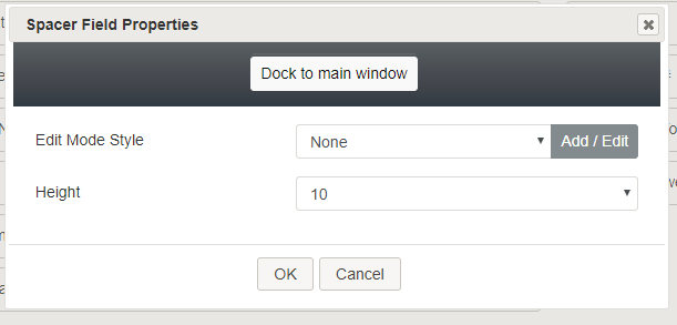
Once you have placed the control onto your form canvas, you can edit the field properties by clicking the pencil icon on the component. The field properties are described as follows.

Edit Mode Style
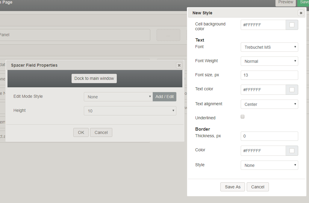
Edit Mode Style is the common property that allows you to select, edit, or add a style for this form control. For example, you may select "Hyperlink" from the selector, and click Add / Edit to change the style (e.g., text, font, color, etc.) of the email address hyperlink.

Height
You can change the height of the spacer by selecting a value from the Height property drop-down list: ½, 1 ½, 2, 3, 4, 5, 6, 7, 8, 9, 10. Each numeric value represents the number of rows to take on the form.