Summary Text
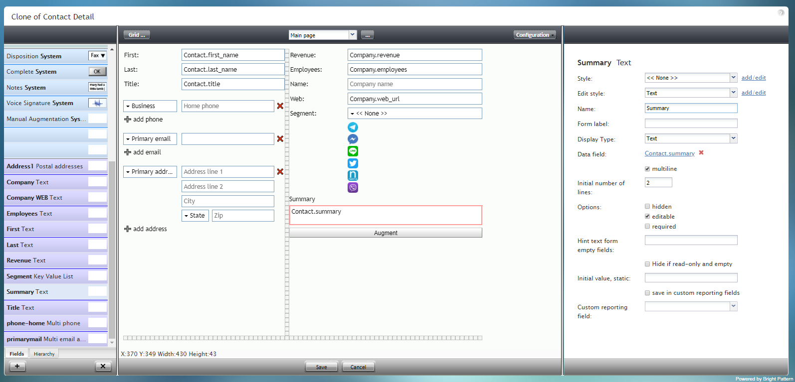
Summary Text is a text field for entering disposition notes that are saved with an interaction. The component is outlined in red on the example form shown.
To add this component to your form, hold and drag the component from the component menu on the left, onto the blank form on the right.
Field Properties
This component's field properties are described as follows.
Style
The Style property allows you to change the way that a control element appears on a form.
You can select a style from the following options:
- << None >>
- Text
- Title
- Label
- Hyperlink
- Note
You can also click add/edit to add another style or edit the selected style, choosing from different fonts, sizes, colors, and other style elements.
Clicking Save as allows you to name and save the style you just added/edited, and that style becomes available in the drop-down selector for the Style and Edit Style properties.
Edit Style
The Edit Style property allows you to select the style defined in the Style property. The style you select here is what is shown on the form.
Name
The Name property allows you to change the name of the control as it appears on the Control Palette. For example, you can change the name "Summary Text" to simply "Interaction Summary" or anything else.
Form label
The Form label is the text label for this control, and it is shown on the form itself. For example, specifying form label "Agent Summary" will display "Agent Summary" on the form beside the Summary Text field.
Display Type
For this control, the display type is automatically set to Text. Note that there are many other display types from which to choose.
Data field
The data field is a variable that gets and fills in the agent's summary notes (if available) for that contact on the form. For this control, the Data field is automatically set to Contact.summary, but you can click the link to select a specific data field to map to this field instead.
multiline
Select the multiline checkbox to indicate multiple lines of text for this field.
Initial number of lines
If the multiline box is checked, you can specify the number of lines of text to include in this field.
Options
- Hidden - Select this option to hide the field on the form. The label will be there, but the field to enter text will not.
- Editable - Select this option to allow the user to edit the field on the form.
- Required - Select this option to require the user to fill in the field on the form.
Hint text form empty fields
You provide a hint to the people completing this form by entering some text into Hint text form empty fields (e.g., "Summary of interaction").
Hide if read-only and empty
Like the Hidden option, selecting the Hide if read-only and empty option will hide the field from view.
Initial value, static
The initial value helps people to know what to type in that field. It's default text that appears in the Summary field on editable preview. For example, entering "interaction summary" in this property will place "interaction summary" into the form field.
save in custom reporting fields
Select this checkbox to save data from this form field in custom reporting fields for your contact center.
Custom reporting field
The Custom reporting field is the custom reporting field created for your contact center (if any). Such a field is unique to your contact center, as it is different from any default fields. If you do not have any custom reporting fields, select None from the drop-down list.