From Bright Pattern Documentation
imported>Elizabeth |
(Marked this version for translation) |
||
| Line 1: | Line 1: | ||
| − | <translate>= Messenger= | + | <translate>= Messenger= <!--T:14--> |
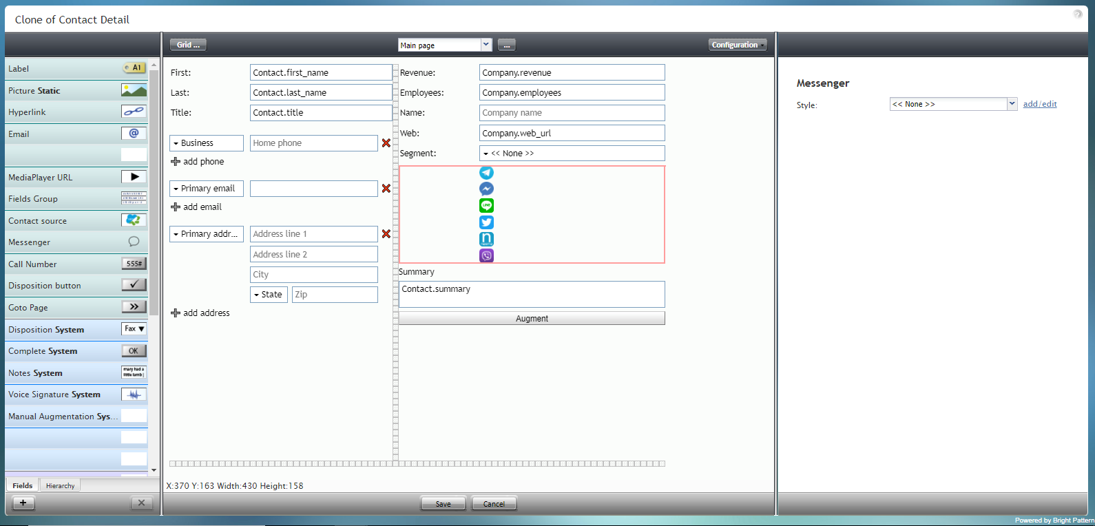
The Messenger component is a special type of control that displays an array of icons for messengers such as Facebook Messenger, LINE, Telegram, and Viber. | The Messenger component is a special type of control that displays an array of icons for messengers such as Facebook Messenger, LINE, Telegram, and Viber. | ||
| Line 5: | Line 5: | ||
| + | <!--T:15--> | ||
[[File:Form-Messenger-3x-50.PNG|800px|thumbnail|center|Messenger component in Configuration mode]] | [[File:Form-Messenger-3x-50.PNG|800px|thumbnail|center|Messenger component in Configuration mode]] | ||
Revision as of 22:25, 8 September 2021
• 日本語
<translate>= Messenger= The Messenger component is a special type of control that displays an array of icons for messengers such as Facebook Messenger, LINE, Telegram, and Viber.
Note: This control is supported in version 5.x for forms created in the Form Builder application version 3.x. For component properties, see Bright Pattern Contact Center Documentation version 3.x.
</translate>/prevnext/

