From Bright Pattern Documentation
Jump to: navigation, search
This page contains changes which are not marked for translation.
• 5.19 • 5.2 • 5.3 • 5.8

Messenger

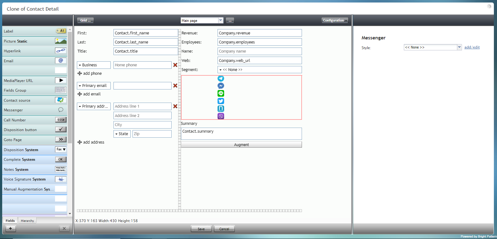
The Messenger component is a special type of control that displays an array of icons for messengers such as Facebook Messenger, LINE, Telegram, and Viber.

If messenger integrations have been configured for your contact center, these icons will link to a saved messenger contact via the data field array Contact.messengers. Messenger integrations are configured in the Contact Center Administrator application, section Integration Accounts.

The Messenger component is outlined in red on the example form shown.

To add this component to your form, hold and drag the component from the component menu on the left, onto the blank form on the right.

Note: This control is supported in version 5.x for forms created in the Form Builder application version 3.x.


Messenger component in Configuration mode


Field Properties

This component has just one property that can be edited: Style.


Messenger field properties


Style

The Style property allows you to change the way that a control element appears on a form. Because the Messenger component shows up on the form as a series of icons, it's recommended that the style be set to None.

You can select a style from the following options:

  • << None >>
  • Text
  • Title
  • Label
  • Hyperlink
  • Note

You can also click add/edit to add another style or edit the selected style, choosing from different fonts, sizes, colors, and other style elements.


Select font, size, color, and other style elements


Clicking Save as allows you to name and save the style you just added/edited, and that style becomes available in the drop-down selector for the Style and Edit Style properties.


Save the style with a new name


< Previous | Next >