|
|
| (9 intermediate revisions by one other user not shown) |
| Line 1: |
Line 1: |
| − | = メッセンジャー= | + | = Messenger= |
| − | メッセンジャーコンポーネントは、Facebook Messenger、LINE、Telegram、Viberなどのメッセンジャーのアイコンの配列を表示する特別なタイプのコントロールです。
| + | The Messenger component is a special type of control that displays an array of icons for messengers such as Facebook Messenger, LINE, Telegram, and Viber. |
| − | | |
| − | コンタクトセンターにメッセンジャー統合が設定されている場合、これらのアイコンは、データフィールド配列 ''Contact.messengers''を介して保存されたメッセンジャーのコンタクトにリンクします。 メッセンジャー統合は、コンタクトセンター管理者アプリケーションの[[contact-center-administrator-guide/IntegrationAccounts|統合アカウント]]で設定されます。
| |
| | | | |
| − | メッセンジャーコンポーネントは、表示されているフォームの例で赤色で囲まれています。
| + | '''Note''': This control is supported in version 5.x for forms created in the Form Builder application version 3.x. For component properties, see Bright Pattern Contact Center Documentation [https://help3x.brightpattern.com/3.18:Form-builder-reference-guide/Messenger version 3.x]. |
| − | | |
| − | このコンポーネントをフォームに追加するには、コンポーネントをクリックしたまま、左側のコンポーネントメニューから右側の空白のフォームにドラッグします。
| |
| − | | |
| − | '''ご注意''': このコントロールは、フォームビルダーアプリケーションバージョン3.xで作成されたフォーム(バージョン5.x)で使用できます。 | |
| − | | |
| − | | |
| − | [[File:Form-Messenger-3x-50.PNG|800px|thumbnail|center|設定モードにおけるメッセンジャーのコンポーネント]]
| |
| − | | |
| − | | |
| − | == Field Properties ==
| |
| − | This component has just one property that can be edited: Style.
| |
| − | | |
| − | | |
| − | [[File:Form-Messenger-Prop-3x-50.PNG|thumbnail|center|Messenger field properties]]
| |
| − | | |
| − | | |
| − | === Style ===
| |
| − | The ''Style'' property allows you to change the way that a control element appears on a form. Because the Messenger component shows up on the form as a series of icons, it's recommended that the style be set to '''None'''.
| |
| − | | |
| − | You can select a style from the following options:
| |
| − | * << None >>
| |
| − | * Text
| |
| − | * Title
| |
| − | * Label
| |
| − | * Hyperlink
| |
| − | * Note
| |
| − | | |
| − | You can also click '''add/edit''' to add another style or edit the selected style, choosing from different fonts, sizes, colors, and other style elements.
| |
| − | | |
| − | | |
| − | [[File:Form-Edit-Styles-Save-3x-50.PNG|450px|thumbnail|center|Select font, size, color, and other style elements]]
| |
| − | | |
| − | | |
| − | Clicking '''Save as''' allows you to name and save the style you just added/edited, and that style becomes available in the drop-down selector for the ''Style'' and ''Edit Style'' properties.
| |
| | | | |
| | | | |
| − | [[File:Form-Save-As-3x-50.PNG|450px|thumbnail|center|Save the style with a new name]] | + | [[File:Form-Messenger-3x-50.PNG|800px|thumbnail|center|Messenger component in Configuration mode]] |
Latest revision as of 06:30, 9 September 2021
Messenger
The Messenger component is a special type of control that displays an array of icons for messengers such as Facebook Messenger, LINE, Telegram, and Viber.
Note: This control is supported in version 5.x for forms created in the Form Builder application version 3.x. For component properties, see Bright Pattern Contact Center Documentation version 3.x.
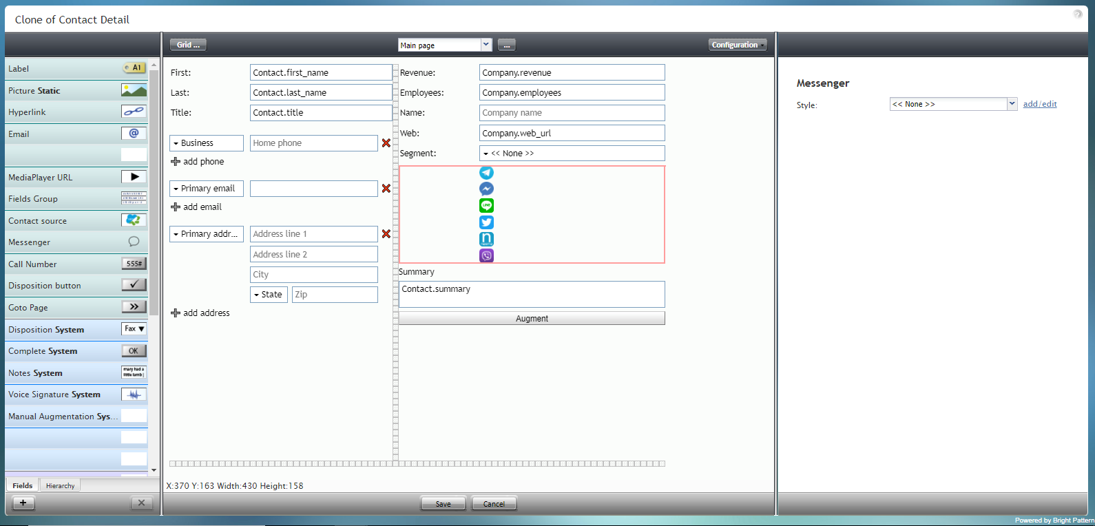
Messenger component in Configuration mode
