提供: Bright Pattern Documentation
(Created page with "'''追加/編集'''をクリックして、別のスタイルの追加、さまざまなフォント、サイズ、色、その他のスタイル要素から選択すること...") |
(Updating to match new version of source page) |
||
| (4 intermediate revisions by one other user not shown) | |||
| Line 1: | Line 1: | ||
| − | = | + | = Messenger= |
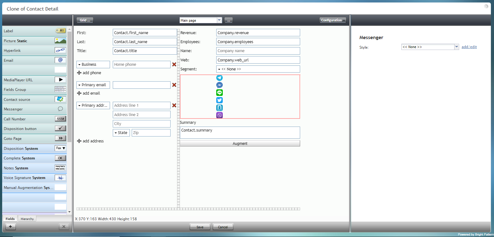
| − | + | The Messenger component is a special type of control that displays an array of icons for messengers such as Facebook Messenger, LINE, Telegram, and Viber. | |
| − | |||
| − | |||
| − | + | '''Note''': This control is supported in version 5.x for forms created in the Form Builder application version 3.x. For component properties, see Bright Pattern Contact Center Documentation [https://help3x.brightpattern.com/3.18:Form-builder-reference-guide/Messenger version 3.x]. | |
| − | |||
| − | |||
| − | |||
| − | ''' | ||
| − | |||
| − | |||
| − | [ | ||
| − | |||
| − | |||
| − | |||
| − | |||
| − | |||
| − | |||
| − | |||
| − | |||
| − | |||
| − | |||
| − | |||
| − | |||
| − | |||
| − | |||
| − | |||
| − | |||
| − | |||
| − | |||
| − | |||
| − | |||
| − | |||
| − | |||
| − | |||
| − | |||
| − | |||
| − | |||
| − | |||
| − | [[File:Form- | + | [[File:Form-Messenger-3x-50.PNG|800px|thumbnail|center|Messenger component in Configuration mode]] |
Latest revision as of 06:30, 9 September 2021
• English
Messenger
The Messenger component is a special type of control that displays an array of icons for messengers such as Facebook Messenger, LINE, Telegram, and Viber.
Note: This control is supported in version 5.x for forms created in the Form Builder application version 3.x. For component properties, see Bright Pattern Contact Center Documentation version 3.x.

