|
|
| (22 intermediate revisions by one other user not shown) |
| Line 1: |
Line 1: |
| − | = 移動ページ= | + | = Goto Page= |
| − | 移動ページは、基本的に、ユーザーをフォームの別のページに移動させるボタンです。 このコンポーネントは、複数ページのフォームに対して適用されます。
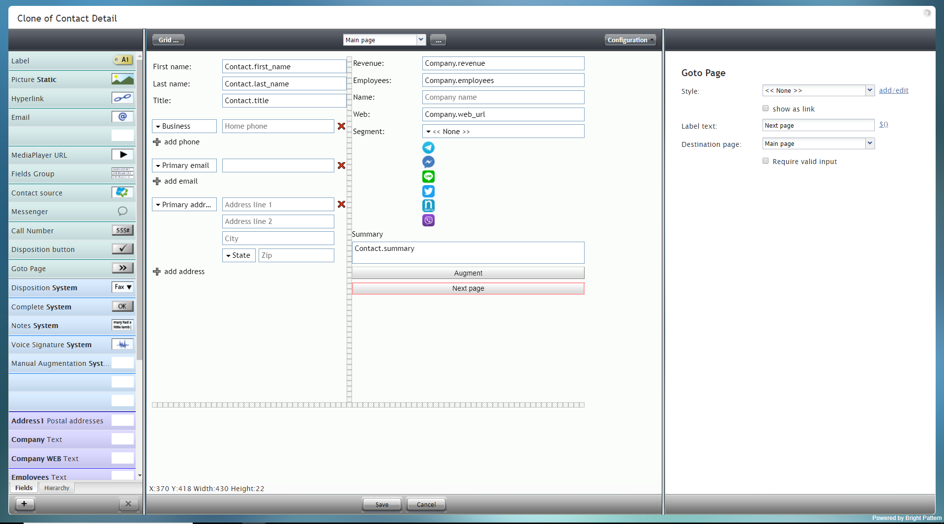
| + | GoTo Page is essentially a button that directs a user to another page of a form. This component is useful only for multi-page forms. |
| | | | |
| − | このコンポーネントをフォームに追加するには、コンポーネントをクリックしたまま、左側のコンポーネントメニューから右側の空白のフォームにドラッグします。
| + | '''Note''': This control is supported in version 5.x for forms created in the Form Builder application version 3.x. For component properties, see Bright Pattern Contact Center Documentation [https://help3x.brightpattern.com/3.18:Form-builder-reference-guide/GotoPage version 3.x]. |
| − | | |
| − | '''ご注意''': このコントロールは、フォームビルダーアプリケーションバージョン3.xで作成されたフォーム(バージョン5.x)で使用できます。 | |
| | | | |
| | | | |
| | [[File:Form-GoTo-Page-3x-50.PNG|800px|thumbnail|center|Goto Page component in Configuration mode]] | | [[File:Form-GoTo-Page-3x-50.PNG|800px|thumbnail|center|Goto Page component in Configuration mode]] |
| − |
| |
| − |
| |
| − | == Field Properties ==
| |
| − | This component's field properties are described as follows.
| |
| − |
| |
| − |
| |
| − | [[File:GoTo-Page-Properties-3x-50.PNG|450px|thumbnail|center|Goto Page field properties]]
| |
| − |
| |
| − |
| |
| − | === Style ===
| |
| − | The ''Style'' property allows you to change the way that a control element appears on a form.
| |
| − |
| |
| − | You can select a style from the following options:
| |
| − | * << None >>
| |
| − | * Text
| |
| − | * Title
| |
| − | * Label
| |
| − | * Hyperlink
| |
| − | * Note
| |
| − |
| |
| − | You can also click '''add/edit''' to add another style or edit the selected style, choosing from different fonts, sizes, colors, and other style elements.
| |
| − |
| |
| − |
| |
| − | [[File:Form-Edit-Styles-Save-3x-50.PNG|350px|thumbnail|center|Select font, size, color, and other style elements]]
| |
| − |
| |
| − |
| |
| − | Clicking '''Save as''' allows you to name and save the style you just added/edited, and that style becomes available in the drop-down selector for the ''Style'' and ''Edit Style'' properties.
| |
| − |
| |
| − |
| |
| − | [[File:Form-Save-As-3x-50.PNG|350px|thumbnail|center|Save the style with a new name]]
| |
| − |
| |
| − |
| |
| − | === Edit Style ===
| |
| − | The ''Edit Style'' property allows you to select the style defined in the ''Style'' property. The style you select here is what is shown on the form.
| |
| − |
| |
| − | === show as link ===
| |
| − | Select the checkbox for ''show as link'' in order to have the ''Label text'' appear as a hyperlink on the form. Users can click the link to go to the specified form page.
| |
| − |
| |
| − | === Label text ===
| |
| − | The ''Label text'' is the text label for this control, and it is shown on the form itself. For example, specifying form label "Next page" will display "Next page" on the control.
| |
| − |
| |
| − | ==== $() ====
| |
| − | Click '''$()''' to add a variable to the label text that appears on the GoTo Page component. After clicking, you can select a specific data field to map to the field.
| |
| − |
| |
| − | [[File:Form-Company-Data-3x-50.PNG|450px|thumbnail|center|Data field mapping]]
| |
| − |
| |
| − |
| |
| − | === Display Type ===
| |
| − | For this control, the ''display type'' is automatically set to '''None'''. Note that there are many other display types from which to choose.
| |
| − |
| |
| − |
| |
| − | [[File:Form-Company-Display-3x-50.PNG|450px|thumbnail|center|Display type selection]]
| |
| − |
| |
| − |
| |
| − | === Destination page ===
| |
| − | ''Destination page'' is the page where the user will be directed upon click. Using the drop-down selector, select the desired page. Note that the selector shows only the pages available for your form. If you do not see any pages besides "Main Page," you should add a page and try again.
| |
| − |
| |
| − |
| |
| − | [[File:Form-GoTo-Dest-3x-50.PNG|450px|thumbnail|center|Display type selection]]
| |
| − |
| |
| − |
| |
| − | === Require valid input ===
| |
| − | Select the checkbox for ''Require valid input'' to have the system check that there is indeed another form page for the user to view.
| |

