imported>Sergem |
(Updated via BpDeleteTranslateTags script) |
||
| Line 1: | Line 1: | ||
| − | + | = Date Time= | |
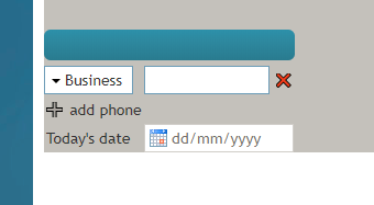
The ''Date/Time'' control places a date and time field on a form. In Preview mode, this control appears as shown. | The ''Date/Time'' control places a date and time field on a form. In Preview mode, this control appears as shown. | ||
| − | |||
[[File:Form-Date-Time-Preview-50.PNG|350px|thumbnail|center|Date/Time on a form]] | [[File:Form-Date-Time-Preview-50.PNG|350px|thumbnail|center|Date/Time on a form]] | ||
| − | == Field Properties == | + | == Field Properties == |
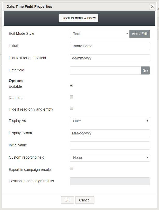
Once you have placed the control onto your form canvas, you can edit the field properties by clicking the pencil icon on the component. The field properties are described as follows. | Once you have placed the control onto your form canvas, you can edit the field properties by clicking the pencil icon on the component. The field properties are described as follows. | ||
| − | |||
[[File:Form-Date-Time-Properties-50.PNG|450px|thumbnail|center|Date/Time properties]] | [[File:Form-Date-Time-Properties-50.PNG|450px|thumbnail|center|Date/Time properties]] | ||
| − | === Edit Mode Style === | + | === Edit Mode Style === |
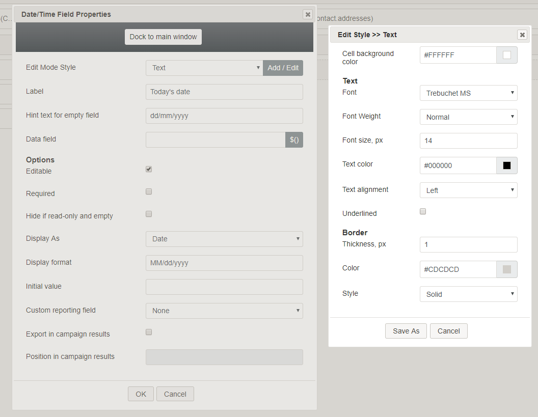
''Edit Mode Style'' is the common property that allows you to select, edit, or add a [[form-builder-reference-guide/CreatingNewForms#Style|style]] for this form control. For example, you may select "Text" from the selector, and click '''Add / Edit''' to change the style (e.g., text, font, color, etc.) of the date and time field displayed on the form. | ''Edit Mode Style'' is the common property that allows you to select, edit, or add a [[form-builder-reference-guide/CreatingNewForms#Style|style]] for this form control. For example, you may select "Text" from the selector, and click '''Add / Edit''' to change the style (e.g., text, font, color, etc.) of the date and time field displayed on the form. | ||
| − | |||
[[File:Form-Date-Time-Style-50.PNG|650px|thumbnail|center|Add / Edit style]] | [[File:Form-Date-Time-Style-50.PNG|650px|thumbnail|center|Add / Edit style]] | ||
| − | === Label === | + | === Label === |
''Label'' is the name of this control that will be displayed on the form (e.g., "Today's date"). | ''Label'' is the name of this control that will be displayed on the form (e.g., "Today's date"). | ||
| − | === Hint text for empty field === | + | === Hint text for empty field === |
This text input field is where you enter any text that you wish to display in this control's empty fields. The hint text indicates to the user what kind of text belongs in this field (e.g., "dd/mm/yyyy"). | This text input field is where you enter any text that you wish to display in this control's empty fields. The hint text indicates to the user what kind of text belongs in this field (e.g., "dd/mm/yyyy"). | ||
| − | === Data field === | + | === Data field === |
The ''data field'' is where you enter a specific variable or select a variable to get and insert data into the Date/Time field. | The ''data field'' is where you enter a specific variable or select a variable to get and insert data into the Date/Time field. | ||
| − | === Options === | + | === Options === |
==== Editable ==== | ==== Editable ==== | ||
Select this checkbox to allow users to edit these phone number types. | Select this checkbox to allow users to edit these phone number types. | ||
| − | ==== Required ==== | + | ==== Required ==== |
Select this checkbox to require users to enter phone numbers in these fields. Note that ''Required'' is enabled only if the field is editable. | Select this checkbox to require users to enter phone numbers in these fields. Note that ''Required'' is enabled only if the field is editable. | ||
| − | ==== Display As ==== | + | ==== Display As ==== |
From the drop-down list, select one of the following display types: | From the drop-down list, select one of the following display types: | ||
* Date | * Date | ||
| Line 46: | Line 43: | ||
* Custom | * Custom | ||
| − | ==== Display format ==== | + | ==== Display format ==== |
When you select a ''Display As'' type, the ''Display Format'' automatically changes to match your selection. For example, the Time display type is down with "hh:mm a" as its display format. | When you select a ''Display As'' type, the ''Display Format'' automatically changes to match your selection. For example, the Time display type is down with "hh:mm a" as its display format. | ||
| − | |||
The display formats correspond to the display types: | The display formats correspond to the display types: | ||
* '''Date''' - MM/dd/yyyy | * '''Date''' - MM/dd/yyyy | ||
| Line 56: | Line 52: | ||
* '''Custom''' - This starts with “hh:mm a MM/dd/yyyy” as a default value and remembers what is changed by the user. | * '''Custom''' - This starts with “hh:mm a MM/dd/yyyy” as a default value and remembers what is changed by the user. | ||
| − | ==== Initial value ==== | + | ==== Initial value ==== |
You can indicate the initial value to be shown on the Date/Time control. This is optional. | You can indicate the initial value to be shown on the Date/Time control. This is optional. | ||
| − | ==== Custom reporting field ==== | + | ==== Custom reporting field ==== |
The ''Custom reporting field'' is the [[contact-center-administrator-guide/CustomReportingFields|custom reporting field]] created for your contact center (if any). Such a field is unique to your contact center, as it is different from any default fields. If you do not have any custom reporting fields, select '''None''' from the drop-down list. | The ''Custom reporting field'' is the [[contact-center-administrator-guide/CustomReportingFields|custom reporting field]] created for your contact center (if any). Such a field is unique to your contact center, as it is different from any default fields. If you do not have any custom reporting fields, select '''None''' from the drop-down list. | ||
| − | ==== Export in campaign results ==== | + | ==== Export in campaign results ==== |
Select this checkbox to export the data collected in the Date/Time field in your call center's campaign results. | Select this checkbox to export the data collected in the Date/Time field in your call center's campaign results. | ||
| − | ==== Position in campaign results ==== | + | ==== Position in campaign results ==== |
Indicate the desired position (e.g., "1") for the data collected in the Date/Time field to be placed in campaign results. | Indicate the desired position (e.g., "1") for the data collected in the Date/Time field to be placed in campaign results. | ||
| − | |||
| − | |||
| − | |||
| − | |||
| − | |||
| − | |||
Latest revision as of 04:13, 29 May 2024
Date Time
The Date/Time control places a date and time field on a form. In Preview mode, this control appears as shown.
Field Properties
Once you have placed the control onto your form canvas, you can edit the field properties by clicking the pencil icon on the component. The field properties are described as follows.
Edit Mode Style
Edit Mode Style is the common property that allows you to select, edit, or add a style for this form control. For example, you may select "Text" from the selector, and click Add / Edit to change the style (e.g., text, font, color, etc.) of the date and time field displayed on the form.
Label
Label is the name of this control that will be displayed on the form (e.g., "Today's date").
Hint text for empty field
This text input field is where you enter any text that you wish to display in this control's empty fields. The hint text indicates to the user what kind of text belongs in this field (e.g., "dd/mm/yyyy").
Data field
The data field is where you enter a specific variable or select a variable to get and insert data into the Date/Time field.
Options
Editable
Select this checkbox to allow users to edit these phone number types.
Required
Select this checkbox to require users to enter phone numbers in these fields. Note that Required is enabled only if the field is editable.
Display As
From the drop-down list, select one of the following display types:
- Date
- Time
- Date and Time
- Custom
Display format
When you select a Display As type, the Display Format automatically changes to match your selection. For example, the Time display type is down with "hh:mm a" as its display format.
The display formats correspond to the display types:
- Date - MM/dd/yyyy
- Time - hh:mm a
- Date and Time - hh:mm a MM/dd/yyyy
- Custom - This starts with “hh:mm a MM/dd/yyyy” as a default value and remembers what is changed by the user.
Initial value
You can indicate the initial value to be shown on the Date/Time control. This is optional.
Custom reporting field
The Custom reporting field is the custom reporting field created for your contact center (if any). Such a field is unique to your contact center, as it is different from any default fields. If you do not have any custom reporting fields, select None from the drop-down list.
Export in campaign results
Select this checkbox to export the data collected in the Date/Time field in your call center's campaign results.
Position in campaign results
Indicate the desired position (e.g., "1") for the data collected in the Date/Time field to be placed in campaign results.


