(Marked this version for translation) |
|||
| Line 1: | Line 1: | ||
| − | <translate>= Phone-home Multi phone= | + | <translate>= Phone-home Multi phone= <!--T:1--> |
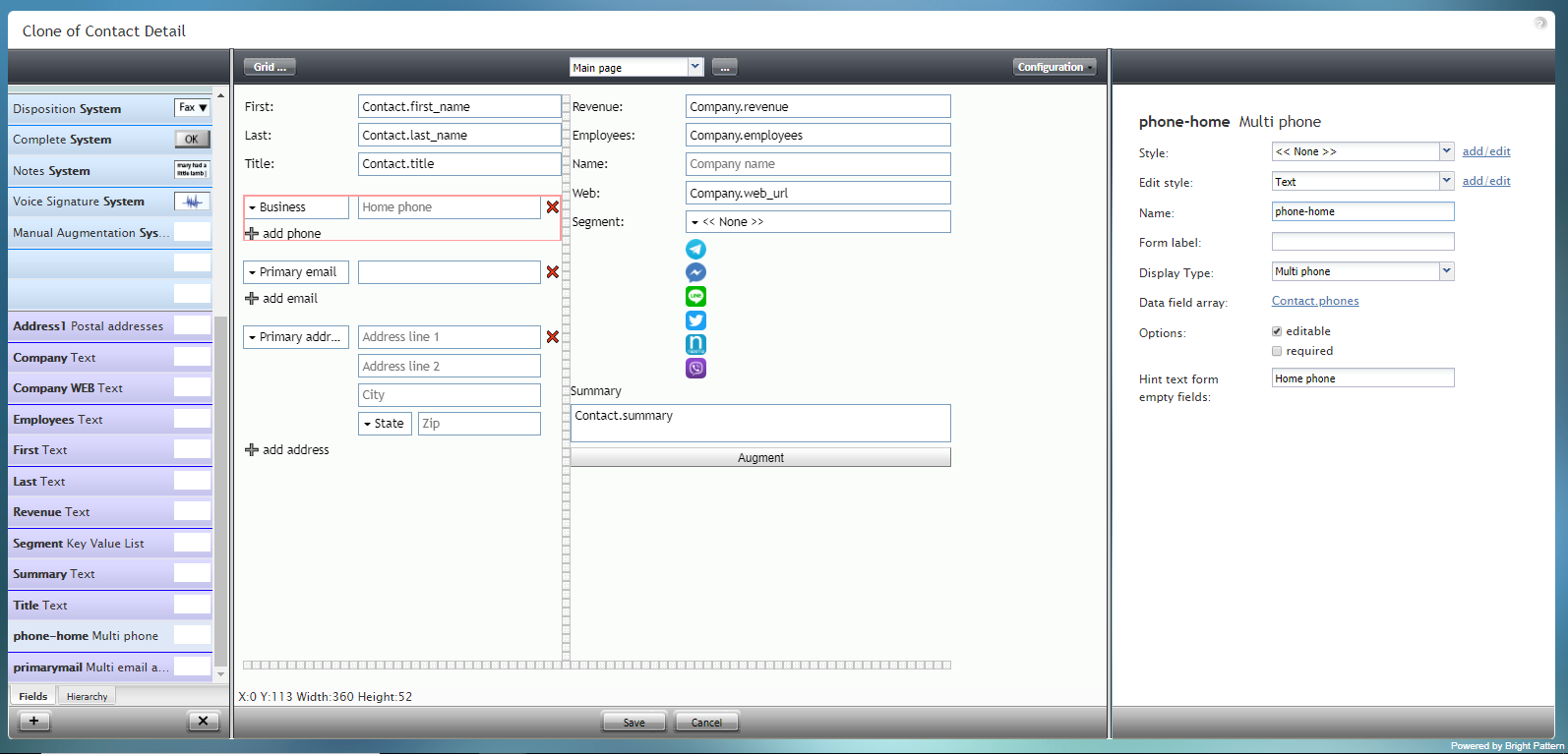
This component adds an "add phone" option, which allows the user to enter multiple phone numbers to a form, if desired. In the image shown, the Phone-home Multi phone component is outlined in red: | This component adds an "add phone" option, which allows the user to enter multiple phone numbers to a form, if desired. In the image shown, the Phone-home Multi phone component is outlined in red: | ||
| + | <!--T:2--> | ||
[[File:Form-Multi-Phone-3x-50.PNG|800px|thumbnail|center|Phone-home Multi phone on a form]] | [[File:Form-Multi-Phone-3x-50.PNG|800px|thumbnail|center|Phone-home Multi phone on a form]] | ||
| − | == Field Properties == | + | == Field Properties == <!--T:3--> |
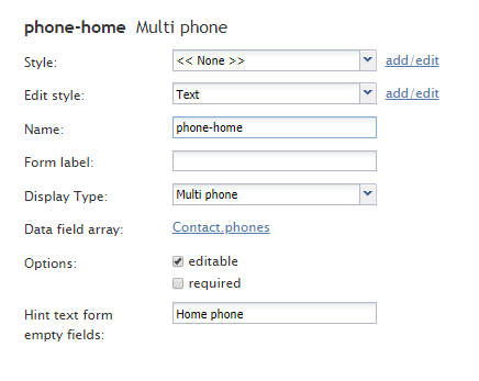
The field properties are described as follows. | The field properties are described as follows. | ||
| + | <!--T:4--> | ||
[[File:Form-Multi-Phone-Prop-3x-50.PNG|450px|thumbnail|center|Form-Multi-Phone-Prop-3x-50.PNG properties]] | [[File:Form-Multi-Phone-Prop-3x-50.PNG|450px|thumbnail|center|Form-Multi-Phone-Prop-3x-50.PNG properties]] | ||
| − | === Style === | + | === Style === <!--T:5--> |
The ''Style'' property allows you to change the way that a control element appears on a form. | The ''Style'' property allows you to change the way that a control element appears on a form. | ||
| + | <!--T:6--> | ||
You can select a style from the following options: | You can select a style from the following options: | ||
* << None >> | * << None >> | ||
| Line 24: | Line 27: | ||
* Note | * Note | ||
| + | <!--T:7--> | ||
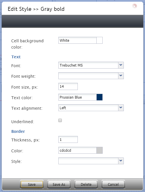
You can also click '''add/edit''' to add another style or edit the selected style, choosing from different fonts, sizes, colors, and other style elements. | You can also click '''add/edit''' to add another style or edit the selected style, choosing from different fonts, sizes, colors, and other style elements. | ||
| + | <!--T:8--> | ||
[[File:Form-Edit-Styles-Save-3x-50.PNG|450px|thumbnail|center|Select font, size, color, and other style elements]] | [[File:Form-Edit-Styles-Save-3x-50.PNG|450px|thumbnail|center|Select font, size, color, and other style elements]] | ||
| + | <!--T:9--> | ||
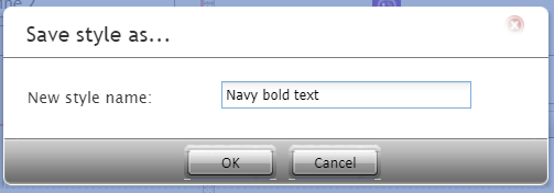
Clicking '''Save as''' allows you to name and save the style you just added/edited, and that style becomes available in the drop-down selector for the ''Style'' and ''Edit Style'' properties. | Clicking '''Save as''' allows you to name and save the style you just added/edited, and that style becomes available in the drop-down selector for the ''Style'' and ''Edit Style'' properties. | ||
| + | <!--T:10--> | ||
[[File:Form-Save-As-3x-50.PNG|450px|thumbnail|center|Save the style with a new name]] | [[File:Form-Save-As-3x-50.PNG|450px|thumbnail|center|Save the style with a new name]] | ||
| − | === Edit Style === | + | === Edit Style === <!--T:11--> |
The ''Edit Style'' property allows you to select the style defined in the ''Style'' property. The style you select here is what is shown on the form. | The ''Edit Style'' property allows you to select the style defined in the ''Style'' property. The style you select here is what is shown on the form. | ||
| − | === Name === | + | === Name === <!--T:12--> |
The ''Name'' property allows you to change the name of the control as it appears on the Control Palette. For example, you can change the name "Phone-home Multi phone" to simply "Phone" or anything else. | The ''Name'' property allows you to change the name of the control as it appears on the Control Palette. For example, you can change the name "Phone-home Multi phone" to simply "Phone" or anything else. | ||
| − | === Form label === | + | === Form label === <!--T:13--> |
The ''Form label'' is the text label for this control, and it is shown on the form itself. For example, specifying form label "Phone" will display "Phone" on the form beside the phone number fields. | The ''Form label'' is the text label for this control, and it is shown on the form itself. For example, specifying form label "Phone" will display "Phone" on the form beside the phone number fields. | ||
| − | === Display Type === | + | === Display Type === <!--T:14--> |
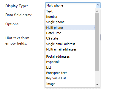
For this control, the ''display type'' is automatically set to '''Multi phone'''. Note that there are many other display types from which to choose. | For this control, the ''display type'' is automatically set to '''Multi phone'''. Note that there are many other display types from which to choose. | ||
| + | <!--T:15--> | ||
[[File:Form-Multi-Phone-Display-50.PNG|450px|thumbnail|center|Display type selection]] | [[File:Form-Multi-Phone-Display-50.PNG|450px|thumbnail|center|Display type selection]] | ||
| − | === Data field array=== | + | === Data field array=== <!--T:16--> |
The data field array is a variable that gets and fills in contact data on the form. For this control, the ''Data field'' is automatically set to '''Contact.phones'''. | The data field array is a variable that gets and fills in contact data on the form. For this control, the ''Data field'' is automatically set to '''Contact.phones'''. | ||
| − | === Options === | + | === Options === <!--T:17--> |
* '''Editable''' - Select this option to allow the user to edit the field on the form. | * '''Editable''' - Select this option to allow the user to edit the field on the form. | ||
* '''Required''' - Select this option to require the user to fill in the field on the form. | * '''Required''' - Select this option to require the user to fill in the field on the form. | ||
| − | === Hint text form empty fields === | + | === Hint text form empty fields === <!--T:18--> |
You provide a hint to the people completing this form by entering some text into ''Hint text form empty fields'' (e.g., "your phone number" or "home, mobile, or business phone"). | You provide a hint to the people completing this form by entering some text into ''Hint text form empty fields'' (e.g., "your phone number" or "home, mobile, or business phone"). | ||
Revision as of 01:08, 14 March 2020
<translate>= Phone-home Multi phone= This component adds an "add phone" option, which allows the user to enter multiple phone numbers to a form, if desired. In the image shown, the Phone-home Multi phone component is outlined in red:
Field Properties
The field properties are described as follows.
Style
The Style property allows you to change the way that a control element appears on a form.
You can select a style from the following options:
- << None >>
- Text
- Title
- Label
- Hyperlink
- Note
You can also click add/edit to add another style or edit the selected style, choosing from different fonts, sizes, colors, and other style elements.
Clicking Save as allows you to name and save the style you just added/edited, and that style becomes available in the drop-down selector for the Style and Edit Style properties.
Edit Style
The Edit Style property allows you to select the style defined in the Style property. The style you select here is what is shown on the form.
Name
The Name property allows you to change the name of the control as it appears on the Control Palette. For example, you can change the name "Phone-home Multi phone" to simply "Phone" or anything else.
Form label
The Form label is the text label for this control, and it is shown on the form itself. For example, specifying form label "Phone" will display "Phone" on the form beside the phone number fields.
Display Type
For this control, the display type is automatically set to Multi phone. Note that there are many other display types from which to choose.
Data field array
The data field array is a variable that gets and fills in contact data on the form. For this control, the Data field is automatically set to Contact.phones.
Options
- Editable - Select this option to allow the user to edit the field on the form.
- Required - Select this option to require the user to fill in the field on the form.
Hint text form empty fields
You provide a hint to the people completing this form by entering some text into Hint text form empty fields (e.g., "your phone number" or "home, mobile, or business phone").
</translate>

