From Bright Pattern Documentation
(Marked this version for translation) |
|||
| Line 1: | Line 1: | ||
| − | <translate>= Complete System= | + | <translate>= Complete System= <!--T:1--> |
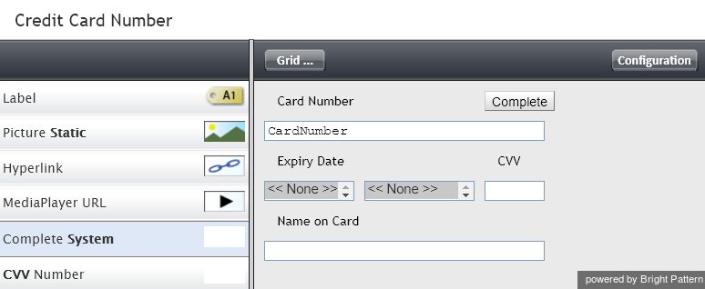
The Complete System component is a button that duplicates the function of the '''Complete''' button of the Agent Desktop application. For more information, see section [[agent-guide/HowtoWrapUpAfter-callWork|How to Wrap Up After-Call Work]] of the ''Agent Guide''. A form can have only one component of this type. | The Complete System component is a button that duplicates the function of the '''Complete''' button of the Agent Desktop application. For more information, see section [[agent-guide/HowtoWrapUpAfter-callWork|How to Wrap Up After-Call Work]] of the ''Agent Guide''. A form can have only one component of this type. | ||
| + | <!--T:2--> | ||
To add this component to your activity form, hold and drag the component from the component menu on the left, onto the blank form on the right. | To add this component to your activity form, hold and drag the component from the component menu on the left, onto the blank form on the right. | ||
| + | <!--T:3--> | ||
'''Note''': This control is supported in version 5.x for forms created in the Form Builder application version 3.x. | '''Note''': This control is supported in version 5.x for forms created in the Form Builder application version 3.x. | ||
| + | <!--T:4--> | ||
[[File:CC-Complete-System-316.png|650px|thumbnail|center|Complete System button component in Preview mode]] | [[File:CC-Complete-System-316.png|650px|thumbnail|center|Complete System button component in Preview mode]] | ||
| − | == Settings == | + | == Settings == <!--T:5--> |
Style settings can be specified for the Complete System component. | Style settings can be specified for the Complete System component. | ||
| − | === Style === | + | === Style === <!--T:6--> |
Select or define the [[form-builder-reference-guide/FormBuilderOverview|text style]] for this element. Choose from the following options: | Select or define the [[form-builder-reference-guide/FormBuilderOverview|text style]] for this element. Choose from the following options: | ||
* << None >> | * << None >> | ||
| Line 23: | Line 26: | ||
| + | <!--T:7--> | ||
[[File:Complete-System-Settings-316.png|400px|center|Credit card chat form complete system settings]] | [[File:Complete-System-Settings-316.png|400px|center|Credit card chat form complete system settings]] | ||
Revision as of 01:02, 14 March 2020
• 日本語
<translate>= Complete System= The Complete System component is a button that duplicates the function of the Complete button of the Agent Desktop application. For more information, see section How to Wrap Up After-Call Work of the Agent Guide. A form can have only one component of this type.
To add this component to your activity form, hold and drag the component from the component menu on the left, onto the blank form on the right.
Note: This control is supported in version 5.x for forms created in the Form Builder application version 3.x.
Settings
Style settings can be specified for the Complete System component.
Style
Select or define the text style for this element. Choose from the following options:
- << None >>
- Text
- Title
- Label
- Hyperlink
- Note
</translate>


