Working with Form Fields
The Chat Widget Configuration application allows you to build forms into your chat widgets, which customers will complete and submit to your contact center.
The various field types and labels shown on the form may be edited or deleted. You can add more fields as needed.
How to Edit a Field
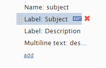
- To change the field type or label text of a field, move your cursor over the field name and click EDIT.
- Then change the field type and/or label.
How to Delete a Field
To remove any of these fields from the form, move your cursor over the field name and click the red X.
How to Add a Field
- Click add.
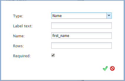
- Select the field type.
- In the Label field, enter the text to be shown as the field label.
Field Types
Select from the following field types:
- Label - The name of the field
- Callback phone number - The phone number at which the customer wants to be called back
- Phone number - The customer's phone number
- Email - The customer's email address
- Name - The customer's name
- Text - Free-form text to be provided on the form
- Date - Today's date
- Multiline text - Multiple lines of text to be provided on the form
- Numerical range slider - A slider to be included on the form
- Radio buttons - Selectable buttons
- Selection list - Drop-down list of options
- Captcha - Proof that the customer is not a robot
Common Field Properties
When editing or creating new fields, many field types have common properties. They include the following:
Label Text
Filling in the Label text property will allow text to appear in the background of a field. The Label text will no longer be seen when a customer begins typing in this field.
Name
The Name property is used to collect data for a given field. For example, if you create a text field for a customer to enter their first name, first_name could be entered as the Name property value; it would then be associated with this field.
Rows
With the Rows property, it is possible to add rows to a multiline text field; this makes the text entry box larger. To change the number of rows, enter a numerical value. Please note, if a value of 0 or no value is entered, the default amount of rows shown is 2.
Min Value and Max Value
Min value and Max value are available only for the numerical range slider. Any numerical values may be entered but the slider will only work if the max value is greater than the min value.
Options
The Options property is available for the radio buttons and selection list fields. Under these fields, Options allows you to add selectable buttons to the chat widget.
Required Box
Checking the Required box property makes the field mandatory to fill out.


