(Marked this version for translation) |
|||
| Line 1: | Line 1: | ||
| − | <translate>= Manual Augmentation System= | + | <translate>= Manual Augmentation System= <!--T:1--> |
The Manual Augmentation System component is a button that enables any form with contact fields to be augmented with more contact data. Note that this component only works if data augmentation is configured in your contact center's [[contact-center-administrator-guide/IntegrationAccounts|Integration Accounts]] with data providers such as The Data Group and Next Caller. | The Manual Augmentation System component is a button that enables any form with contact fields to be augmented with more contact data. Note that this component only works if data augmentation is configured in your contact center's [[contact-center-administrator-guide/IntegrationAccounts|Integration Accounts]] with data providers such as The Data Group and Next Caller. | ||
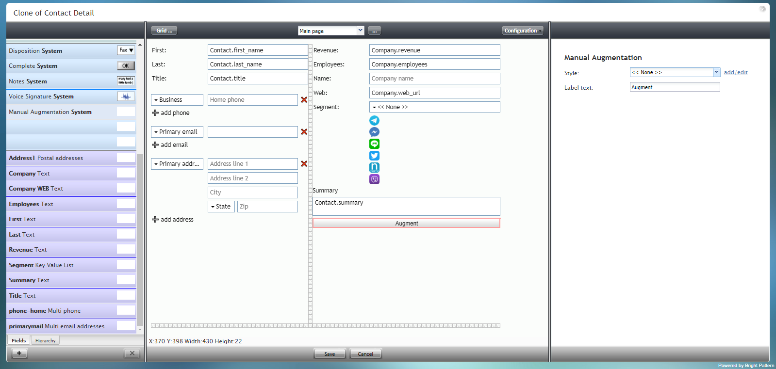
The Manual Augmentation System component is outlined in red on the example form shown. | The Manual Augmentation System component is outlined in red on the example form shown. | ||
| + | <!--T:2--> | ||
To add this component to your form, hold and drag the component from the component menu on the left, onto the blank form on the right. | To add this component to your form, hold and drag the component from the component menu on the left, onto the blank form on the right. | ||
| + | <!--T:3--> | ||
'''Note''': This control is supported in version 5.x for forms created in the Form Builder application version 3.x. | '''Note''': This control is supported in version 5.x for forms created in the Form Builder application version 3.x. | ||
| + | <!--T:4--> | ||
[[File:Form-Manual-Aug-3x-50.PNG|800px|thumbnail|center|Manual Augmentation System component in Configuration mode]] | [[File:Form-Manual-Aug-3x-50.PNG|800px|thumbnail|center|Manual Augmentation System component in Configuration mode]] | ||
| − | == Field Properties == | + | == Field Properties == <!--T:5--> |
This component's field properties are described as follows. | This component's field properties are described as follows. | ||
| + | <!--T:6--> | ||
[[File:Form-Manual-Aug-Prop-3x-50.PNG|thumbnail|center|Manual Augmentation System field properties]] | [[File:Form-Manual-Aug-Prop-3x-50.PNG|thumbnail|center|Manual Augmentation System field properties]] | ||
| − | === Style === | + | === Style === <!--T:7--> |
The ''Style'' property allows you to change the way that a control element appears on a form. | The ''Style'' property allows you to change the way that a control element appears on a form. | ||
| + | <!--T:8--> | ||
You can select a style from the following options: | You can select a style from the following options: | ||
* << None >> | * << None >> | ||
| Line 30: | Line 35: | ||
* Note | * Note | ||
| + | <!--T:9--> | ||
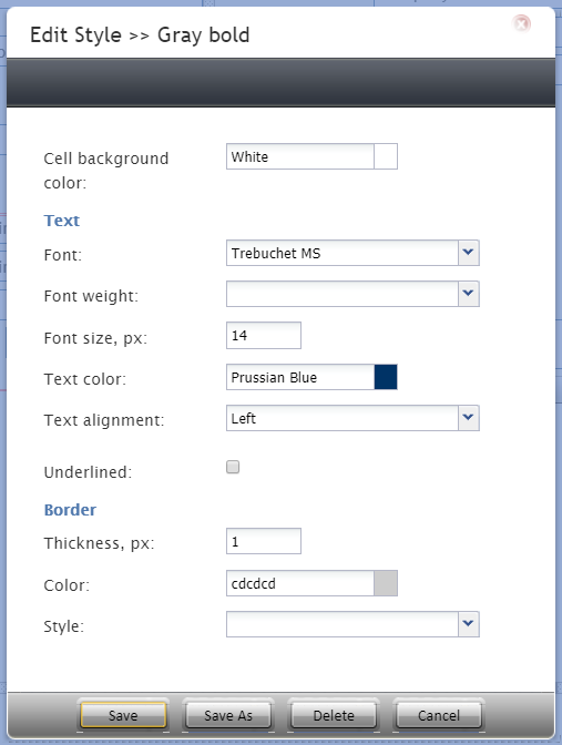
You can also click '''add/edit''' to add another style or edit the selected style, choosing from different fonts, sizes, colors, and other style elements. | You can also click '''add/edit''' to add another style or edit the selected style, choosing from different fonts, sizes, colors, and other style elements. | ||
| + | <!--T:10--> | ||
[[File:Form-Edit-Styles-Save-3x-50.PNG|450px|thumbnail|center|Select font, size, color, and other style elements]] | [[File:Form-Edit-Styles-Save-3x-50.PNG|450px|thumbnail|center|Select font, size, color, and other style elements]] | ||
| + | <!--T:11--> | ||
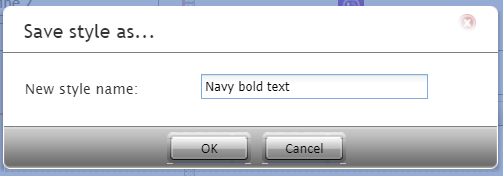
Clicking '''Save as''' allows you to name and save the style you just added/edited, and that style becomes available in the drop-down selector for the ''Style'' and ''Edit Style'' properties. | Clicking '''Save as''' allows you to name and save the style you just added/edited, and that style becomes available in the drop-down selector for the ''Style'' and ''Edit Style'' properties. | ||
| + | <!--T:12--> | ||
[[File:Form-Save-As-3x-50.PNG|450px|thumbnail|center|Save the style with a new name]] | [[File:Form-Save-As-3x-50.PNG|450px|thumbnail|center|Save the style with a new name]] | ||
| − | === Edit Style === | + | === Edit Style === <!--T:13--> |
The ''Edit Style'' property allows you to select the style defined in the ''Style'' property. The style you select here is what is shown on the form. | The ''Edit Style'' property allows you to select the style defined in the ''Style'' property. The style you select here is what is shown on the form. | ||
| − | === Label text === | + | === Label text === <!--T:14--> |
The ''Label text'' is the text label for this control, and it is shown on the form itself. For example, specifying form label "Augment this!" will display "Augment this!" on the control. | The ''Label text'' is the text label for this control, and it is shown on the form itself. For example, specifying form label "Augment this!" will display "Augment this!" on the control. | ||
Revision as of 01:06, 14 March 2020
<translate>= Manual Augmentation System= The Manual Augmentation System component is a button that enables any form with contact fields to be augmented with more contact data. Note that this component only works if data augmentation is configured in your contact center's Integration Accounts with data providers such as The Data Group and Next Caller.
The Manual Augmentation System component is outlined in red on the example form shown.
To add this component to your form, hold and drag the component from the component menu on the left, onto the blank form on the right.
Note: This control is supported in version 5.x for forms created in the Form Builder application version 3.x.
Field Properties
This component's field properties are described as follows.
Style
The Style property allows you to change the way that a control element appears on a form.
You can select a style from the following options:
- << None >>
- Text
- Title
- Label
- Hyperlink
- Note
You can also click add/edit to add another style or edit the selected style, choosing from different fonts, sizes, colors, and other style elements.
Clicking Save as allows you to name and save the style you just added/edited, and that style becomes available in the drop-down selector for the Style and Edit Style properties.
Edit Style
The Edit Style property allows you to select the style defined in the Style property. The style you select here is what is shown on the form.
Label text
The Label text is the text label for this control, and it is shown on the form itself. For example, specifying form label "Augment this!" will display "Augment this!" on the control.
</translate>


