Chat Widget Styling
In the Chat Widget Configuration application, you can edit the style of your chat widget to suit your organization's brand, website style, logo, and so forth.
Properties
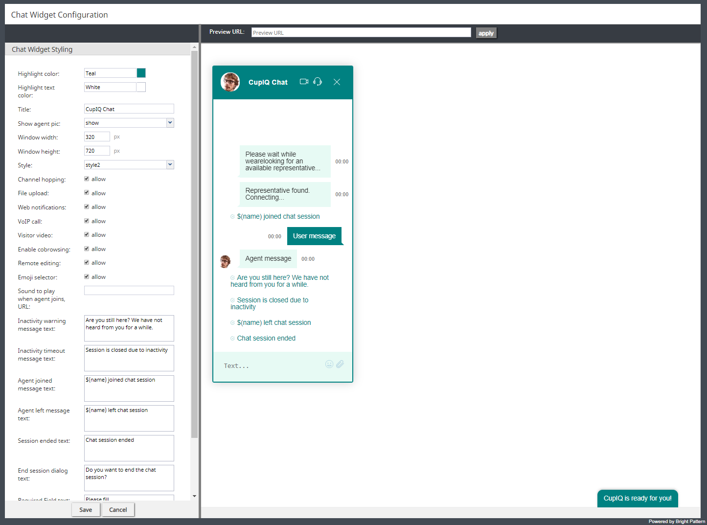
The following properties determine the overall appearance of the chat widget. As you edit style properties, the preview pane on the right side of the screen will display the changes you are making to the widget.
Highlight color
Highlight color is the color shown at the top of the widget, as the text color of the system's automatically sent messages (e.g., "Chat session ended"), and as the background color of the customer's text. You can select this color from the given list of 40 web colors.
Highlight text color
Highlight text color is the color of the customer's text. You can select from the given list of 40 web colors to help differentiate the customer's text from the agent's.
Title
Title is the name of your chat widget. Having a title is helpful when you have multiple chat widget configurations and need to identify them quickly.
Show agent pic
Select the Show agent pic checkbox if you wish the agent's user profile photo to be shown during a chat interaction. Select from the following options:
- none
- show
- always show default
Window width
The window width can be specified in pixels.
Window height
The window height can be specified in pixels.
Style
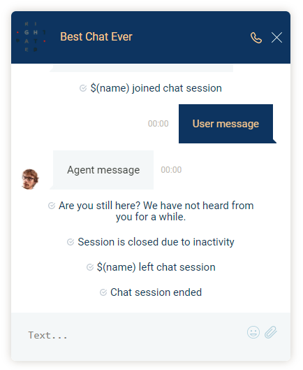
There are two display styles from which to choose: style1 and style2. Style1 places a border around the entire widget, and style2 has no border.
Channel hopping
To enable customers to move the conversation from rich web chat to another media channel (i.e., SMS, Facebook Messenger, LINE, Telegram, Viber), select the allow checkbox. Note that channel hopping can be enabled only if the other channel types are supported and configured for your contact center.
File upload
To allow customers to upload photos, documents, or other such files to a chat interaction, select the allow checkbox.
Web notifications
Select allow for web notifications to appear for new chat messages.
VoIP call
Select allow to enable the customer and agent to talk on a VoIP call while chatting. Notice that when you select allow, the headset icon appears on the chat widget. Either customers or agents can click the headset icon to initiate the VoIP call. The call can be disconnected by clicking the phone button.
Visitor video
Select allow to enable the customer and agent to talk on a video call while chatting. Notice that when you select allow, the video camera icon appears on the chat widget. Either customers or agents can click the video camera icon to initiate the video call. The video can be disconnected by clicking the phone button.
Enable co-browsing
Select allow to enable the customer to share their screen with the agent and follow the customer’s scrolling movements. Co-browsing is initiated during the chat by the customer--not the agent--and screen sharing ends when either the customer clicks Co-browsing button or when the chat is terminated.
Notes:
- Starting from version 5.3.19, this option has been moved to the Scenario Entry configuration page and removed from Chat Widget Styling. Note that you will need to enable the new setting, Enable co-browsing, for co-browsing to work.
- For customers who configured chat per the full chat code on older versions of Bright Pattern Contact Center and are upgrading to any versions between 5.3.5 and 5.3.18: If the togetherJS_enabled variable was used to enable co-browsing, after you upgrade this option will have priority over the variable after any changes are made and saved in Chat Widget Styling. If you wish to configure co-browsing, we recommend enabling this setting in Chat Widget Styling.
Widget minimization
This setting allows the customer to minimize and restore the chat widget at any time. When minimized, customers will see a message alert (i.e., a red badge) on the chat widget tab if new chat messages are sent from the agent; the number in the badge represents the number of messages the agent has sent since the widget was minimized. Note that this setting is enabled by default.
Remote editing
When enabled, remote editing allows agents to enter or update data via the customer’s screen. Note that this option is available only if the setting Enable cobrowsing is enabled, and if so, this setting is enabled by default.
Emoji selector
If the emoji selector option is enabled, agents and customers can click on the emoji icon, which pops the emoji selector tab; when selected, the emojis will appear in chat messages. Note that this option is enabled by default.
Sound to play when agent joins, URL
If a sound should be played when an agent joins the conversation, enter the URL of the sound here.
Inactivity warning message text
When a chat interaction has been idle for too long, the inactivity warning message text will appear on both the agent's and customer's screens. Enter the contents of the message in the text entry field (e.g., "Your chat session will expire due to inactivity.").
Inactivity timeout message text
Upon timeout, inactive chat interactions will pop the inactivity timeout message text on both the agent's and customer's screens. Enter the contents of the message in the text entry field (e.g., "Your chat session has expired due to inactivity.").
Agent joined message text
The "agent joined message text is added to the chat interaction when an agent accepts it. Enter the message to appear in the chat interaction (e.g., "Agent $(first.name) has joined the chat."). You can use variables in the message.
Agent left message text
The "agent left message text is added to the chat interaction when the agent has either left completed the interaction or transferred it to another agent. Enter the message to appear in the chat interaction (e.g., "Agent $(first.name) has left the chat."). You can use variables in the message.
Session ended text
The session ended text appears in the chat interaction when the chat has been terminated (e.g., "This chat session has ended. Have a great day!").
End session dialog text
The end session dialog text message appears when customers attempt to end the chat by closing the chat widget (e.g., "Do you want to end the chat session?").
Required Field text
The Required Field text field lets you configure the message that appears when pre-chat form required fields are not filled out (e.g., "Please fill").
Refers to Required Fields text
The Refers to Required Fields text field lets you configure the message that appears when referring to required fields (e.g., "* Refers to Required Fields").
Invalid Input Field text
The Invalid Input Field text field allows you to configure the text that appears when invalid input is entered in a field.
Notifications prompt
The Notifications prompt field lets you configure the text that appears at the top of the chat widget that prompts users to allow notifications from their web browsers.
Co-browsing dialog text
If Surfly integration is configured for your contact center, the Co-browsing dialog text field allows you to configure the text that appears in the co-browsing dialog that pops to customers, prompting them to accept the session.
Note: If you are creating a new messaging/chat scenario entry, this text box will be prepopulated with the following: "By clicking Accept, an agent will join you on the page you are currently viewing. The agent can view and help you as you browse the web in this tab. The agent will not see login details, passwords, other browser tabs or programs you have opened. You can stop co-browsing at any time, by clicking X in the menu or by closing this tab in your browser."
If you are upgrading to Bright Pattern Contact Center version 5.3.19 with an existing messaging/chat scenario entry, note that this text box will be empty.


