How to View and Understand Your Quality Score
The Quality Score provides a snapshot of how you are doing at work. When your interactions are reviewed and evaluated, certain areas of your work (e.g., how you greet the customer, whether you follow procedure, etc.) are evaluated and assigned a numeric score. The scores for selected evaluation areas from all evaluations of your interactions contribute toward your overall quality score, which is displayed on the Quality Scorecard and the Quality Score widget.
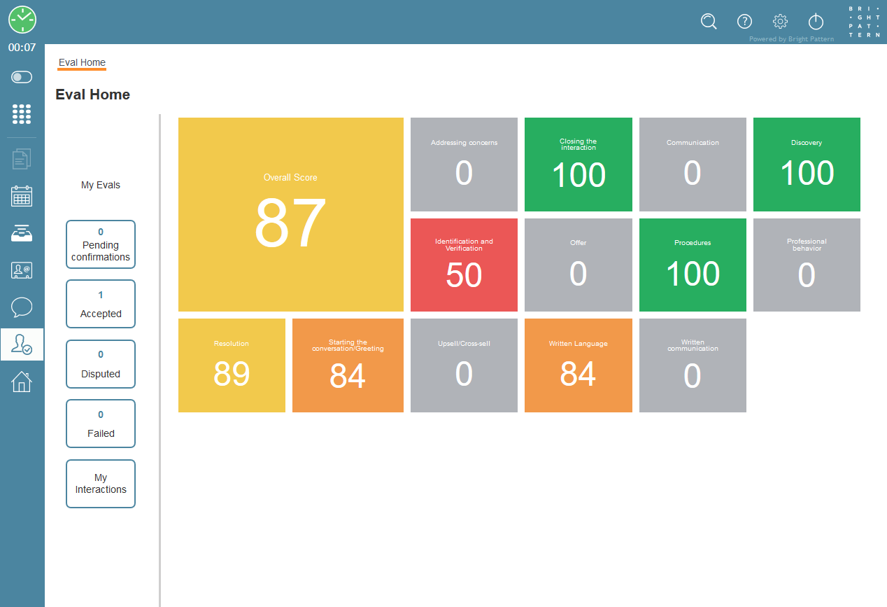
The Quality Scorecard displays your average quality score from various shared evaluation areas. Each area is color-coded to match the displayed score (e.g., green for high marks, red for low marks). The Quality Scorecard displays your scores graphically, in colorful boxes (i.e., cards) with large score numbers.
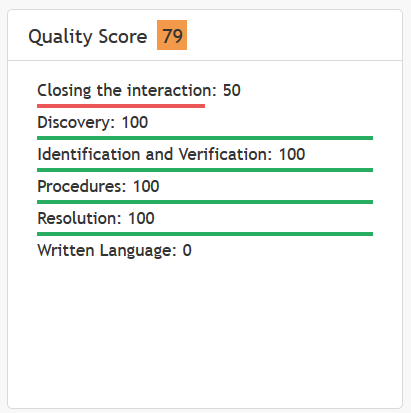
The Quality Score widget shares the same data as the Quality Scorecard, but it displays it in a different way, as a simple list on a single widget.
How to View the Quality Scorecard
- On the Agent Desktop application’s navigation bar, click on the Quality Management icon.

- The Eval Home screen appears, with My Evals on the left side and Quality Scorecard on the right side.
- The Quality Scorecard displays your scores for selected evaluation areas from all evaluations of your interactions. The scores will be refreshed automatically, as evaluations for your interactions are completed.
The Eval Home screen for agents
How to View the Quality Score Widget
- On the Agent Desktop application’s navigation bar, click on the Home Page icon to bring up your Home Page.

- In addition to the Home Page widgets you are already familiar with, you will see a new widget called Quality Score.
- The Quality Score widget displays your scores for selected evaluation areas from all evaluations of your interactions.
Example of the Quality Score widget
Understanding Your Quality Score
Let’s look at what the Quality Score widget displays.
Note that the evaluation areas are set by your administrator, so what you see may differ from the example widget shown.
Overall Score
The number at the top of the widget is your overall quality score (e.g., “79”). Quality scores can range from 0 to 100, where 0 means no data, 20 is the default score for worst quality, and 100 means best quality.
Evaluation Area Score
Underneath “Quality Score,” you will see how the quality score of each evaluation area contributes to your overall quality score. The names of all the evaluation areas configured for your contact center service are shown with a corresponding number (e.g., “Identification and Verification: 100”).
Score by Color
Colors are used for visualizing each evaluation area that has a score greater than 0. An evaluation area underlined in red represents poor quality, a yellow underline represents average quality, and a green underline represents high quality. If an evaluation area has a score of 0, there is no data to support a score, and it is not underlined in any color.
Interpreting the Score
High scores and lots of green indicate that you are doing great. Medium scores and lots of yellow indicate that there is room to grow in the given evaluation areas. Low scores and lots of red indicate that training and improvement is needed.

