Resources Management Using the Services Dashboard
One of the goals as a supervisor is to make sure that the right number of agents with the right skills are doing the right things at the right times. For a service's or a team's given demand, too few or not the right resources will result in unhappy customers and unhappy agents, and having too many agents will mean forgoing revenue opportunities or cost savings potential.
Using the Services Dashboard, you can gain workforce management insights for organizing your team's resources by using Bright Pattern Contact Center's historical interaction data to identify critical over- and under-staffings and providing call centers a demand-vs-resources overview. Though supervisors are not only restricted to their own team's data, the dashboard provides the basics to evaluate a supervisor's planning quality.
Note: The Services Dashboard must be enabled for your contact center by your service provider. In order to view this dashboard, supervisors must have the View historical reports privilege. Speak to your contact center administrator in order to be granted this privilege.
This article explains how to use the Services Dashboard in order to manage your teams and services efficiently.
Access the Services Dashboard
If you have been granted the appropriate Supervisor privileges and your call center has turned on the Services Dashboard, you can find the Service Dashboard tab by choosing the Supervisor ![]() icon in Agent Desktop.
icon in Agent Desktop.
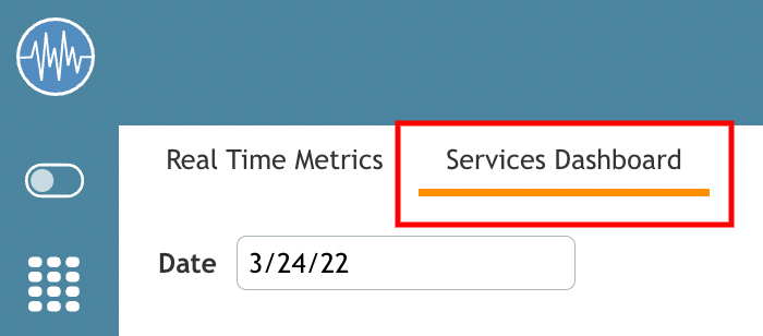
There will be two links at the top: Real Time Metrics and Supervisor Dashboard.
Choose Supervisor Dashboard.
Review Services and Dates
In order to view the specific metrics for your individual teams, you must first choose a date and a service. Using the drop-down menus next to these selections allows you to examine how each team is doing on a deeper, more granular level.
Note that you may only review one day and one service at a time.
Example: Your call center has a Customer Service team and a Retention team. You can view how well your Customer Service team did on a specific date, or how well your Retention team did on a specific date, but you can not review how well both the Customer Service and Retention teams did at the same time on the same date.
Date Selection
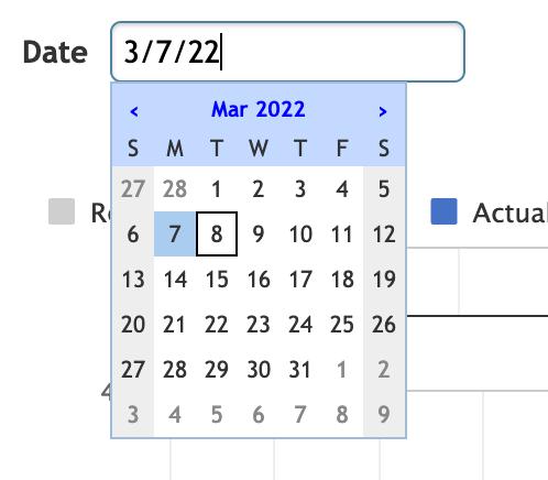
Supervisors can select the date to display the available historical data for that day.
“Date” drops down a calendar control that allows you to pick a single day to examine. By default, the date selection will show the current day initially. The dashboard will be updated at when you login or after you change the service or date dropdown choices. Agent Desktop will use your timezone to request data for the whole day (a 24 hour period).
Note: If you select the current day, the data is displayed up to the last complete full hour interval.
Service Selection
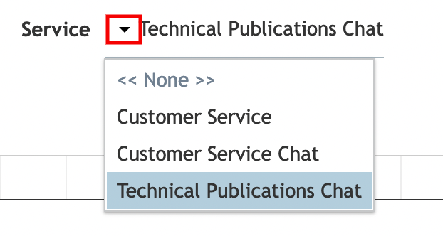
Supervisors can select a service to display the historical service data for the data selected in the Date selection dropdown.
When you select the service for a specific date through the Service selection drop down, the drop-down will only list those services which were active on the selected date. If a service had zero calls on the selected date, that information will still be displayed.
Analyze the Data
Analyzing the dashboard's information provides you an overview of the available resources vs. actual demand for a specific service. It allows you to identify over- or understaffing situations to potentially improve your future planning.
- Logged in agents - Represents the result of scheduling and management
- Call detail - Provides the actual demand
- Service level - Indicates the service level resulting from the actual number of agents with the required skills and the number of calls
Using the Service Dashboard
Charts are created for each service separately; note that multi-skilled agents will be counted in each of the skilled dashboards, as each dashboard compares logged-in agents with matching skills to the required number of agents. If an agent is skilled for Service1, Service2, and Service3, the agent will be counted in each of the three dashboards.
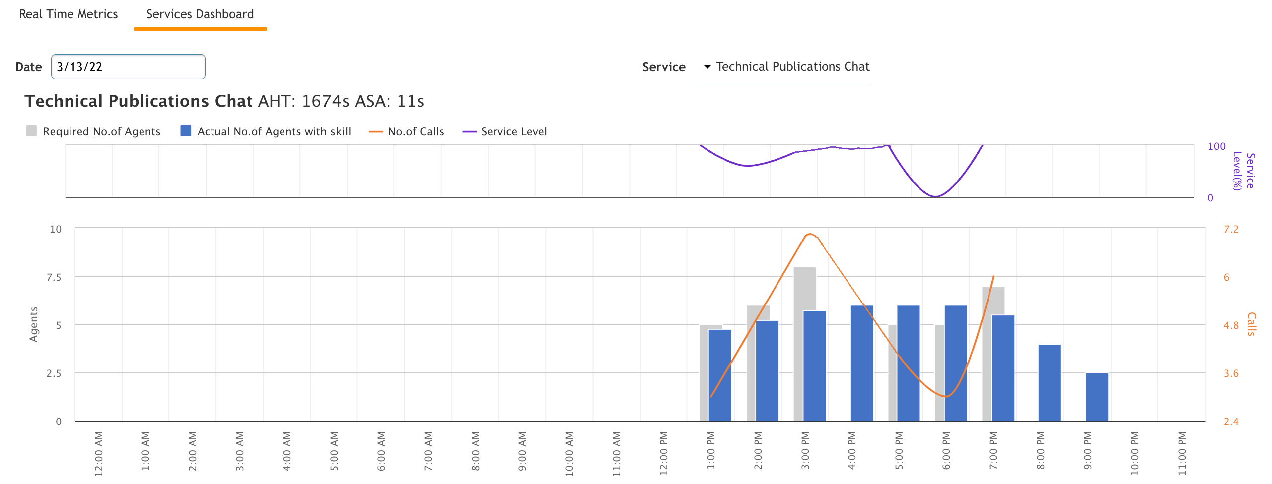
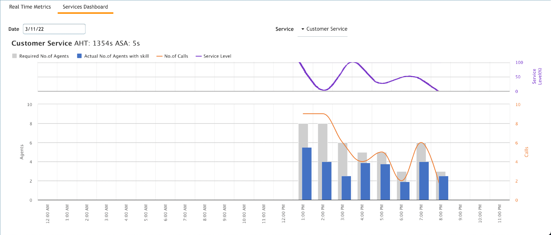
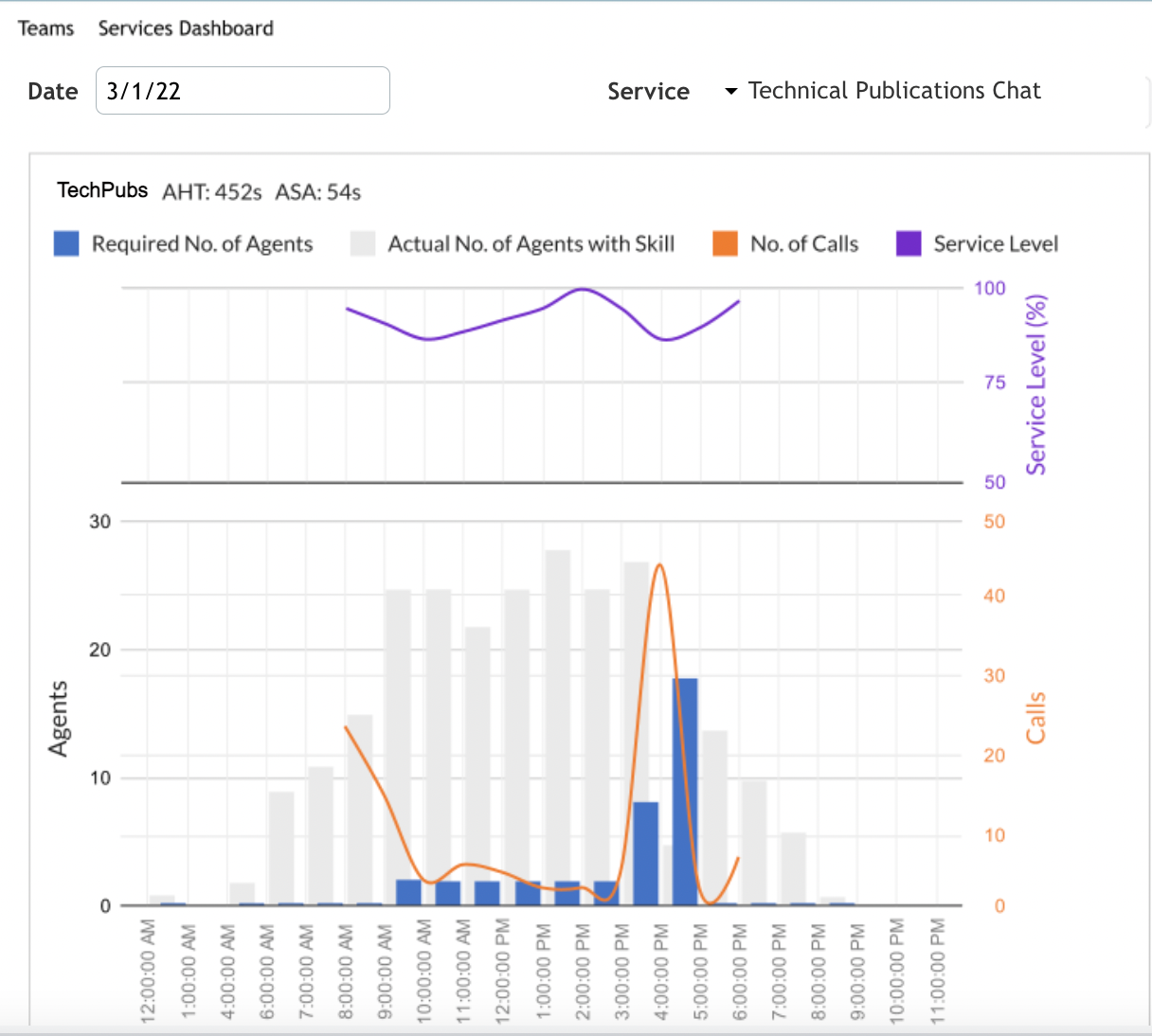
After selecting a date and service, the dashboard will display the following information in a chart in 1 hour time intervals:
- Average handling time (AHT) for the selected day
- Average speed of answer (ASA) for the selected day
- Number of calls per time interval on the selected day
- Service level per time interval
- Required number of agents per time interval
- Actual number of logged in agents with matching service skills
- Average Handling Time (AHT)
- This time is based on Service Metrics report
- Displays the AHT in seconds for the selected day
- Average Speed of Answer (ASA)
- Based on Service Metrics report
- Displays the ASA in seconds for the selected day
- Number of calls
- Based on Call Details report
- The line displays the number of calls per 1 hour time interval.
- Service Level
- Based on the Service in Time report
- This line displays the service level per 1 hour time interval
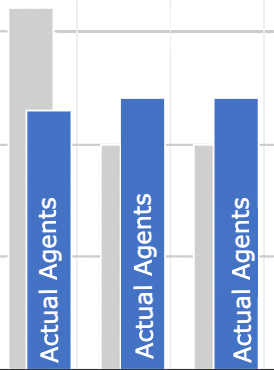
Note: The purple line indicates the service level resulting from the actual number of agents with the required skills and the number of calls. If the blue bar (actual number of agents) is higher than the gray bar (the required agents), the service level is 100% (the purple line). The higher the line is to the top of the chart (100) the better the service/team is performing. That said, 100% may not be optimal and may indicate overstaffing. The typical service level goal is 80/20 (80% of calls answered within 20 seconds).
- Required number of agents
- Based on the Call Details report
- Records can be grouped based on the start time into one-hour intervals
- Determines the number of calls per interval and service
- Uses BP Workforce Calculator Inbound to determine the number of required agents per service and interval using the service’s average handling time (AHT) from the Service Metrics report
- Displays the resulting number of agents per one-hour interval
- Actual number of logged in agents with matching service skills
- Based on Agent Activity report and agent skills
- Records can be grouped based on the start time into one-hour intervals
- This will display the number of logged in, unique agents who have matching service skills within each one-hour interval
Understanding the Chart
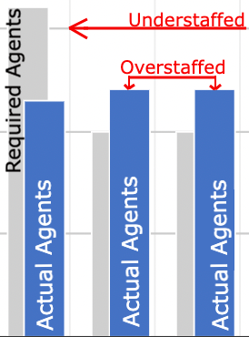
You can use the Supervisor Dashboard to see where you were over and under staffed.
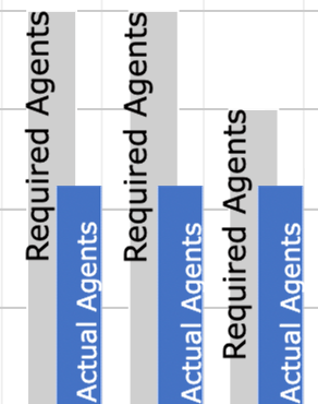
If the gray and blue columns are aligned fairly well, your scheduling balance for that specific date and team was relatively well-planned (i.e., you had enough skilled agents available for the number of calls received that required those skilled agents.)
If the gray and blue columns are not relatively aligned, you had either too many skilled agents available for that team on that date, or you had too few.
Understanding the Service Level
The service level chart is open to interpretation, depending on the needs of your call center or organization.
The purple line indicates the service level resulting from the actual number of agents with the required skills and the number of calls. (E.g., If the actual number of agents are higher than the required agents then the service level will rise toward 100%). It is fair, as a generalization, to assume that the higher the line is to the top of the chart (100 percent notation) that the service/team is overall performing well. The higher the line, the better the service level. That said, 100% may not be optimal as a typical service level goal is 80/20 (80% of calls answered within 20 seconds). This goal is configurable per organization. As such, a 100% service level may indicate overstaffing. Ultimately, an appropriate service level for your call center's needs should be determined on a per-organization basis.
Understanding Number of Calls
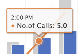
The orange number of calls received line is fairly straightforward. If you click on the orange line itself, it will tell you precisely how many calls were received at that point in time.
Broken Lines
If you notice that your service or number of calls lines are broken on the charts, that represents a break in the service or call flow - your agents may not have been available to take calls, or they were signed out/on break, you may not have received any chats or voice calls during that time period, or there may have been a service outage with your ISP, etc.
Unusual Data
If you note that your charts have been fairly steady in appearance due to your call center having dialed in their required service level to an appropriately configured amount, but one day the information seems off, this is a good time to go back and review the overall data for the day to see if perhaps there was an overarching issue at hand or if it was a singular instance that will not affect your future scheduling needs.

