Time Series Widgets
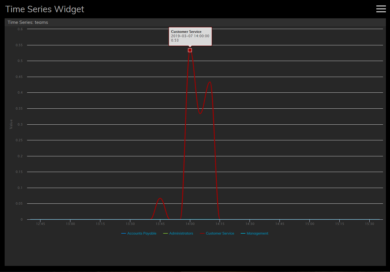
Time Series widgets display data from team or service related statistics and chart them over regular time intervals. Each statistic is displayed on the chart's Y-axis (i.e., vertically), while the selected time interval is displayed on the X-axis of the chart (i.e., horizontally). The visualized data allows you to monitor performance at a glance and analyze it over short or long periods of time.

Settings
Users with the privilege Customize Wallboards may edit the control settings of wallboard widgets. Time Series settings are as follows.
Title
The Title setting allows you to name your widget.
Series Type
There are two series types available for display: Services and Teams. Series type is displayed as a statistic on the Y-axis; the value of each statistic is noted per statistic type. The series type statistics are as follows.
Services Statistics
| Statistic | Value |
| Inbound in queue now | number of calls |
| Inbound in IVR, queue or on agents now | number of calls |
| Inbound interactions answered in Service Level % (moving window) | number of calls |
| Inbound in IVR now | number of calls |
| Inbound received | number of calls |
| Inbound abandoned | number of calls |
Teams Statistics
| Statistic | Value |
| Matching agents busy | number of agents |
| Matching agents logged-in | number of agents |
| Matching agents ready | number of agents |
| Matching agents not ready | number of agents |
| Occupancy of matching agents | percentage |
Time Range
For both Service and Team monitoring, the following time intervals are available for display on the X-axis of the chart:
- 5 minutes
- 15 minutes
- 1 hour
- 3 hours
- 6 hours
- 12 hours
- 24 hours
- 2 days
- 7 days
< Previous | Next >