Check Box Elements
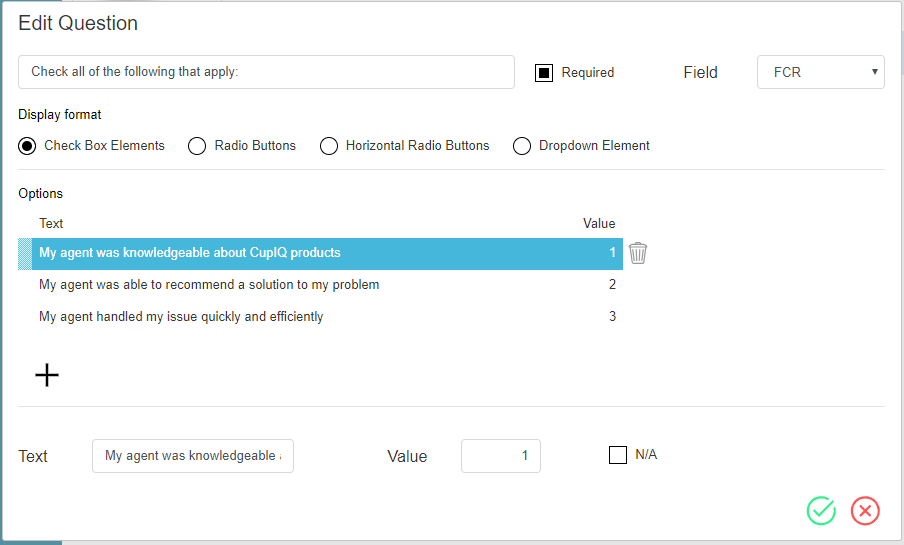
The Check Box Elements control allows you to configure a question with check box options; it is possible for more than one check box to be selected. Check Box Elements are useful for situations where more than one option applies. Note that these options may be assigned values for reporting purposes.
Settings
The settings for the Check Box Elements question are as follows. To edit the question, mouse over the control and select the edit icon. To accept the edit, select the Save
icon; to cancel the edit, select the Cancel
icon.
Question
The question field is where you enter the text of your question.
Required
When selected, the Required checkbox makes an answer for this question mandatory.
Field
The field drop-down menu allows you to select reporting metrics/fields to map to a given question. The following options are available:
- CSAT
- FCR
- NPS
- Any custom fields created in the Contact Center Administrator application, section Custom Survey Fields
Display Format
The display format indicates what type of button or element is being edited. Note that this can be used as a shortcut for changing the type of question without dragging and dropping a new question onto the form canvas.
Options
Options is the area where the answers/options for your questions are configured, and comprises two parts:
- The top section, which displays all configured options, including text and value
- The bottom section, which is where options are configured
Aside from displaying the text and value of a question, the top section of the options area allows you to reorder the current options by drag and drop. If you want to add a new option, click the add icon; if you want to remove an option, click the delete
icon.
In the bottom section, if adding a new option or editing a current one, you will see the Text field, Value field, and the N/A check box.
- Text is the field where you add the text of your option/answer.
- Value is the field where you may enter a number or unique value that will be associated with this option; values can be passed to reports.
- The N/A checkbox, when selected, prevents any value being associated with the option.


