Contents
- Form Builder Reference Guide Introduction
- Purpose
- Audience
- How to Launch Form Builder
- Form Builder OverviewDynamic Layout Editor
- Dynamic UI Overview
- Working with Controls
- Previewing and Saving Forms Static Layout Editor
- Static UI Overview
- Using Form Controls
- Saving FormsAll Form Controls
- Address1 Postal Addresses
- All Email Addresses
- All Phone Numbers
- All Postal Addresses
- Button
- Call Number
- Checkbox
- Company Text
- Complete System
- Contact Source
- Date Time
- Disposition Button
- Disposition System
- Email Address
- Employees Text
- Field
- Fields Group
- First Text
- Goto Page
- Hyperlink
- Label
- Last Text
- List
- Manual Augmentation System
- MediaPlayer URL
- Messenger
- Messengers
- Notes
- Notes System
- Number
- Phone-home Multi phone
- Phone Number
- Picture Static
- Primarymail Multi email addresses
- Revenue Text
- Search Panel
- Segment Key Value List
- Spacer
- Summary Text
- Text
- Title Text
- US State
- Voice Signature
- Voice Signature System
Checkbox
This control places a checkbox on a form, enabling a user to check a specific item on a form. In Preview mode, this control appears as shown.
Field Properties
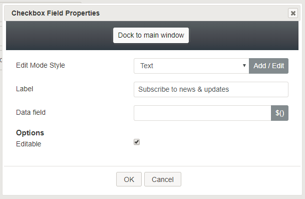
Once you have placed the control onto your form canvas, you can edit the field properties by clicking the pencil icon on the component. The field properties are described as follows.
Edit Mode Style
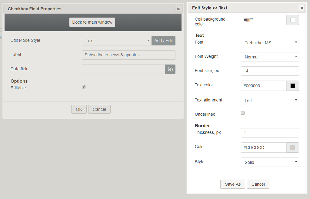
Edit Mode Style is the common property that allows you to select, edit, or add a style for this form control. For example, you may select "Hyperlink" from the selector, and click Add / Edit to change the style (e.g., text, font, color, etc.) of the email address hyperlink.
Label
Label is the name of this control that will be displayed on the form (e.g., "Subscribe" or "Receive updates").
Data field
In the data field, you can enter a variable or select from and insert a variable into this field.
Options
- Editable - Select this checkbox to allow editing.