From Bright Pattern Documentation
Jump to: navigation, search
This page contains changes which are not marked for translation.
• 5.19 • 5.2 • 5.3 • 5.8

Contact Source

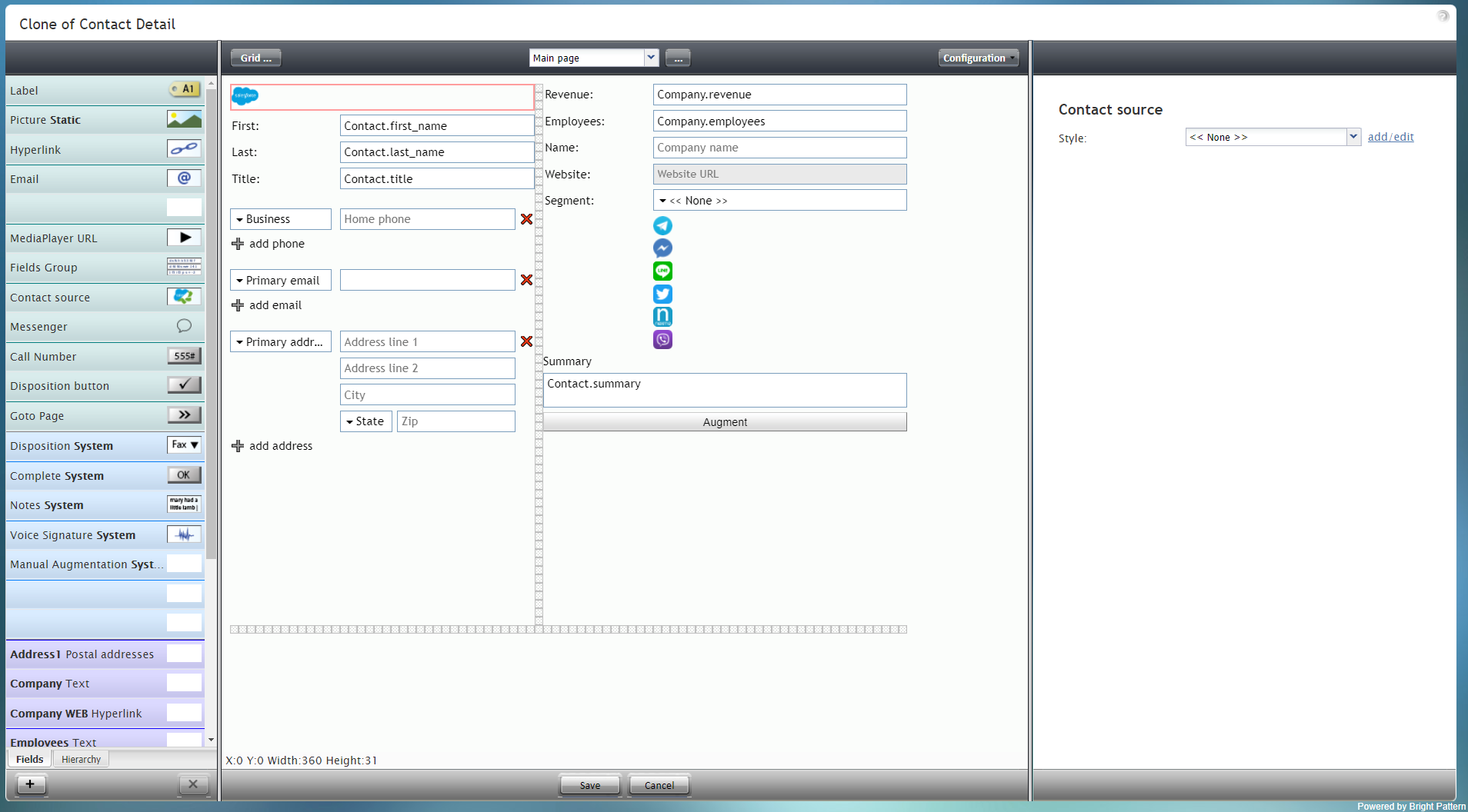
Contact Source is a special type of control that displays an icon if the contact was imported from an external CRM, such as Salesforce.com. In the example form shown, the Contact Source control displays the Salesforce icon and is outlined in red.

To add this component to your form, hold and drag the component from the component menu on the left, onto the blank form on the right.

Note: This control is supported in version 5.x for forms created in the Form Builder application version 3.x.


Contact Source component in Configuration mode


Field Properties

This component has only one property that can be changed: Style.


Contact Source field properties


Style

The Style property allows you to change the way that a control element appears on a form. For this component, you may not wish to use any style at all because the control is displayed as a small image. The default style for this control is None.

The other style options include:

  • << None >>
  • Text
  • Title
  • Label
  • Hyperlink
  • Note

You can also click add/edit to add another style or edit the selected style, choosing from different fonts, sizes, colors, and other style elements.


Select font, size, color, and other style elements


Clicking Save as allows you to name and save the style you just added/edited, and that style becomes available in the drop-down selector for the Style and Edit Style properties.


Save the style with a new name


< Previous | Next >