Static UI Overview
In the Static Layout Editor view, the Form Builder user interface is divided into the following areas:
- Control Palette (the list of system controls and all other types of controls), shown on the left-hand side of the screen
- Form Canvas (where the form is built and edited), shown in the middle of the screen
- Properties Editor (after selecting a control to edit), shown on the right-hand side of the screen
To define a new UI element for your form, select the corresponding control from the control palette, drag it to the desired location on the canvas, and specify its properties in the properties editor.

Form Grid Settings
You can change the overall look of the form (i.e., label width, padding, margins, background color, etc.) by clicking the Grid...  button at the top of Form Builder.
Upon clicking on the Grid... button, the Form Grid Settings dialog will open.

There, you can edit the following settings:
- Columns - The number of columns on the form (e.g., "10")
- Column width, px - The column width in pixels (e.g., "100")
- Rows - The number of rows on the form (e.g., "5")
- Row height, px - The row height in pixels (e.g., "25")
- Resulting form size - The width and height of the finished form (e.g., "1000px × 125px")
- Margin around form, px - The amount of space on the outer edges of the form in pixels (e.g., "10")
- Background color - Background color of the form (e.g., "White Smoke")
- Form label width, px - The width of each form label in pixels (e.g., "40")
Pages
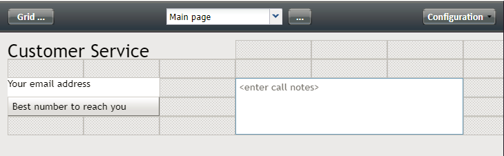
You can have multiple pages on a form. The page selector allows you to select a form to view and edit.

The Form Pages ... button, located to the right of the page selector, allows you to work with multiple form pages. Upon clicking it, the Form Pages dialog opens, where you can take the following actions:
- View all form pages
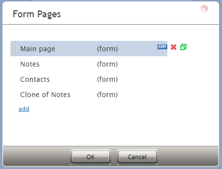
View all form pages - Add more form pages by clicking add
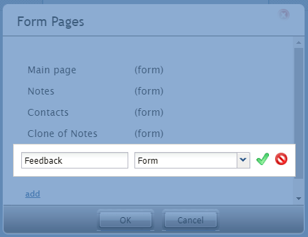
Add new form pages - Edit the name of a form page
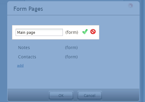
Edit the form name and click the green checkmark to save your changes - Delete a form page by clicking

- Clone a form page by clicking


View Button
Three different views are available in Form Builder:
- Configuration - Where you edit the properties of all your form elements
Configuration view - Preview - Where you see the read-only version of the form
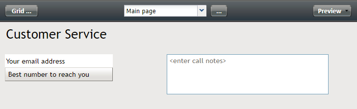
Preview - Editable - A dynamic view where you can both preview the form and type into each field of the form
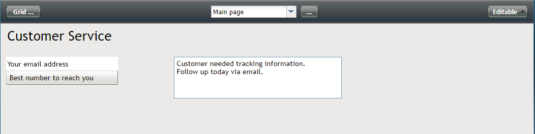
Editable


Clicking the View button allows you to switch between these views. Once you select a view from the selector, the button assumes the name of the view.

Control Palette
The Control Palette lists each available type of control (previously called "form components") and each one has its own configuration attributes that specify the function performed by the control.

System Controls
System Controls are always present at the top of Form Builder. Either buttons or selectors, these controls include Grid... for changing the form settings, the page selector for choosing which form page to edit and/or view, the Form Pages ... button for adding more pages to the form, and the view button for switching between Form Builder views (i.e., Configuration, Preview, and Editable).
Other Control Types
All other controls can be placed on a form any number of times. It is forbidden to create controls with the same name on the same page of the form (an error dialog appears when applying property dialog or moving away from a docked property sheet). Controls with the same name on different pages must have the same type, in order to show the same field on different pages.
Controls that can be present in multiple instances include the following:
- Contact-email
- Contact-phone
- Contact-address
- Contact-messaging-app-account
When added, these controls will show all instances of the field associated with an object.