Segment Key Value List
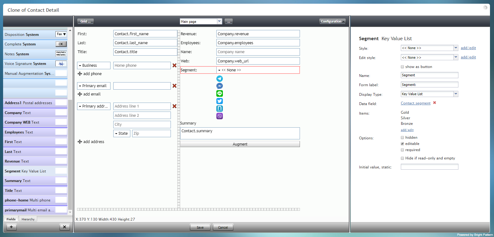
Segment Key Value List is a selector for choosing a priority level (i.e., gold, silver, or bronze) for a customer or contact. The component is outlined in red on the example form shown.
To add this component to your form, hold and drag the component from the component menu on the left, onto the blank form on the right.
Field Properties
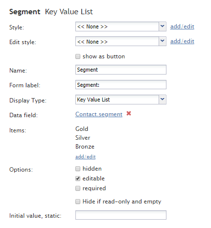
This component's field properties are described as follows.
Style
The Style property allows you to change the way that a control element appears on a form.
You can select a style from the following options:
- << None >>
- Text
- Title
- Label
- Hyperlink
- Note
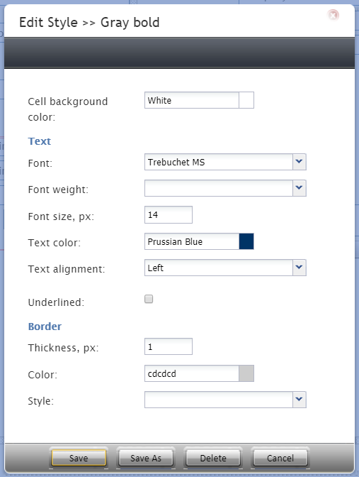
You can also click add/edit to add another style or edit the selected style, choosing from different fonts, sizes, colors, and other style elements.
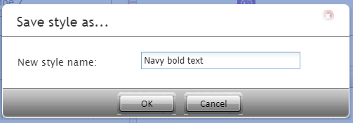
Clicking Save as allows you to name and save the style you just added/edited, and that style becomes available in the drop-down selector for the Style and Edit Style properties.
Edit Style
The Edit Style property allows you to select the style defined in the Style property. The style you select here is what is shown on the form.
Name
The Name property allows you to change the name of the control as it appears on the Control Palette. For example, you can change the name "Segment Key Value List" to simply "Priority" or anything else.
Form label
The Form label is the text label for this control, and it is shown on the form itself. For example, specifying form label "Priority level" will display "Priority level" on the form beside the Segment Key Value List field.
Display Type
For this control, the display type is automatically set to Key Value List. Note that there are many other display types from which to choose.
Data field
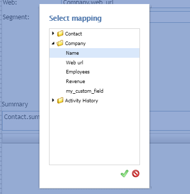
The data field is a variable that gets and fills in the contact's priority level on the form, if known. For this control, the Data field is automatically set to Contact.segment, but you can click the link to select a specific data field to map to this field instead.
Items
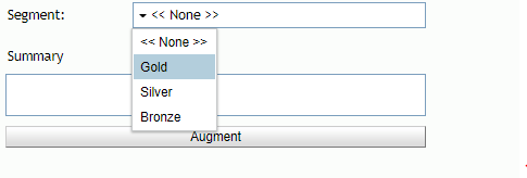
Items are the choices listed in the Segment Key Value List selector. Click add/edit to add or change the items in the selector. For example, adding items Gold, Silver, and Bronze will cause them to be displayed as shown.
Options
- Hidden - Select this option to hide the Segment field on the form. The label will be there, but the field to enter text will not.
- Editable - Select this option to allow the user to edit the field on the form.
- Required - Select this option to require the user to fill in the field on the form.
Hide if read-only and empty
Like the Hidden option, selecting the Hide if read-only and empty option will hide the field from view.
Initial value, static
The initial value helps people to know what to type in that field. It's default text that appears in the Revenue Text field on editable preview. For example, entering "priority" in this property will place "priority" into the form field.

